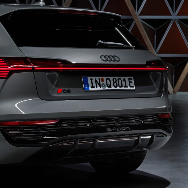
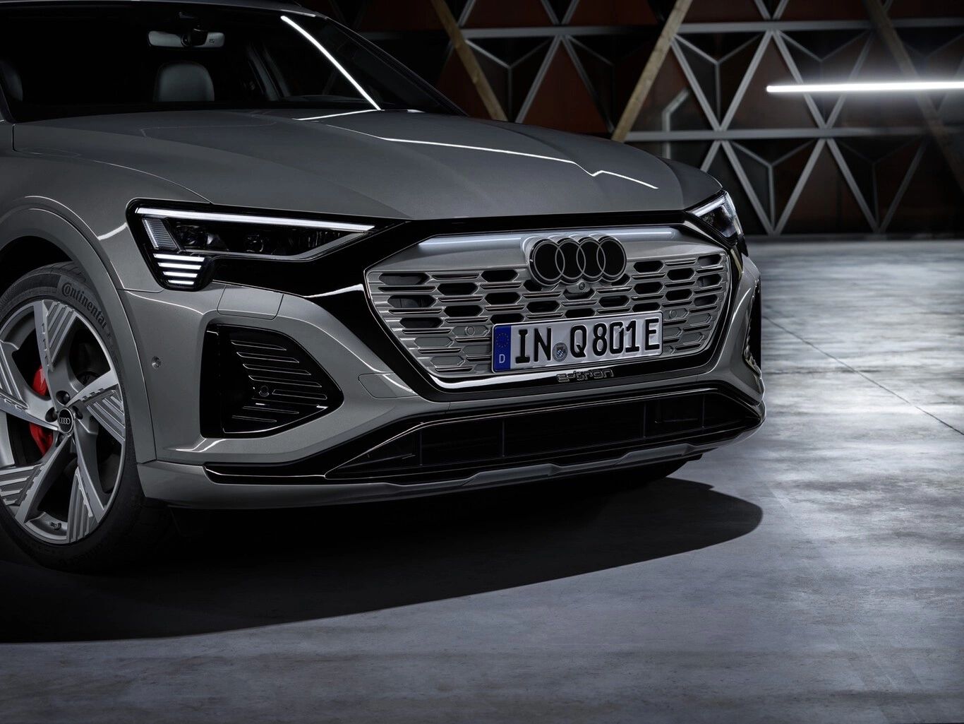
German auto manufacturer Audi has unveiled a flat, simplified version of its distinctive four-ringed logo, making it the latest in a line of car brands to simplify their logos.

Audi’s four rings have been kept in the same formation, but they are no longer raised and have been stripped of their glossy chrome colour. Now, the rings are either white and framed by a thin black border or dark grey with black borders.
The rebrand means Audi joins car brands Volvo, Nissan and Vauxhall, among others that have also traded in three-dimensional logos for two-dimensional versions.

According to the company, the simplified logo was created as part of a rebrand that aims to strengthen appeal and popularity among consumers. It will be rolled out on all new Audi vehicles.
“The new two-dimensional look gives our rings a significantly more modern and even more graphic makeover, although their geometry is almost identical to the former ones,” said Audi head of design André Georgi.
“We want the four rings to look the same everywhere in the future: whether in a magazine, on your smartphone, or a billboard – and on or inside the car,” he continued.
“As a progressive premium brand, Audi targets modern customers who value high-quality design and attention to detail,” added Audi brand strategist Frederik Kalisch.
Audi, which means to listen Latin, believes that the new colourway is clearer and more easily identifiable against differently coloured car grilles and backgrounds.
“The thin black border around the rings makes for a consistent, premium-quality appearance, regardless of the car’s paint or radiator grille color,” explained Georgi.
“We’re keeping it consistently free of chrome with a high-contrast black-and-white look,” he said. “By optically brightening the logo, the white lends the rings a flat, premium-quality look, which still appears three-dimensional in detail.”

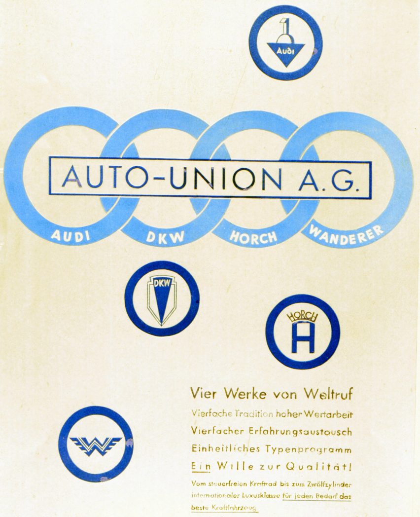
Described by the brand as “the most famous rings in the world – aside from the Olympic rings”, the original Audi logo was designed in 1932.
Each ring represents one of four individual independent car manufacturers – Audi, DKW, Horch and Wanderer – that merged to become Auto Union AG in Saxony during the global recession in the 1930s. The logo is designed to symbolise the “inseparable unity of the four founder companies”.
The original Audi logo had been slightly altered in previous redesigns but the rings remained unchanged in every logo throughout the brand’s 90-year history.
Flattened rings first appeared in digital settings such as online marketing communications in 2016 “as a consequence of digitalisation”.

“Our vision is to move the corporate identity from the digital area onto our vehicles and to standardize vehicle identification across all models,” Georgi said.
Other car brands opting for flat designs to better suit a modern customer are Volvo, which updated its Iron mark logo to flat, less colourful version last year, as well as Toyota, which launched a two-dimensional logo as part of its rebrand by agency The&Partnership.
Video: Audi launches flat logo with black and white rings in push to be “more modern”
The imagery is courtesy of Audi.
Source: dezeen.com


