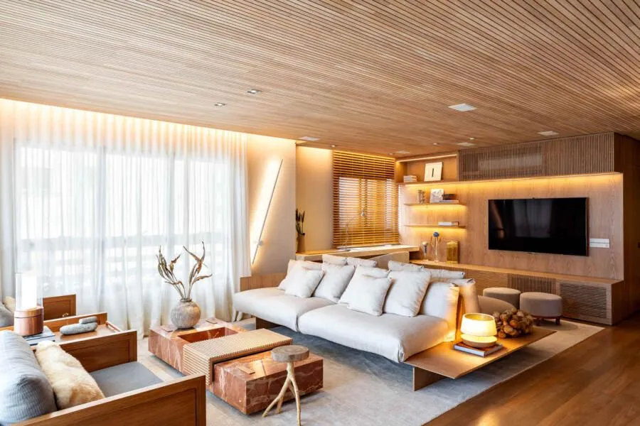
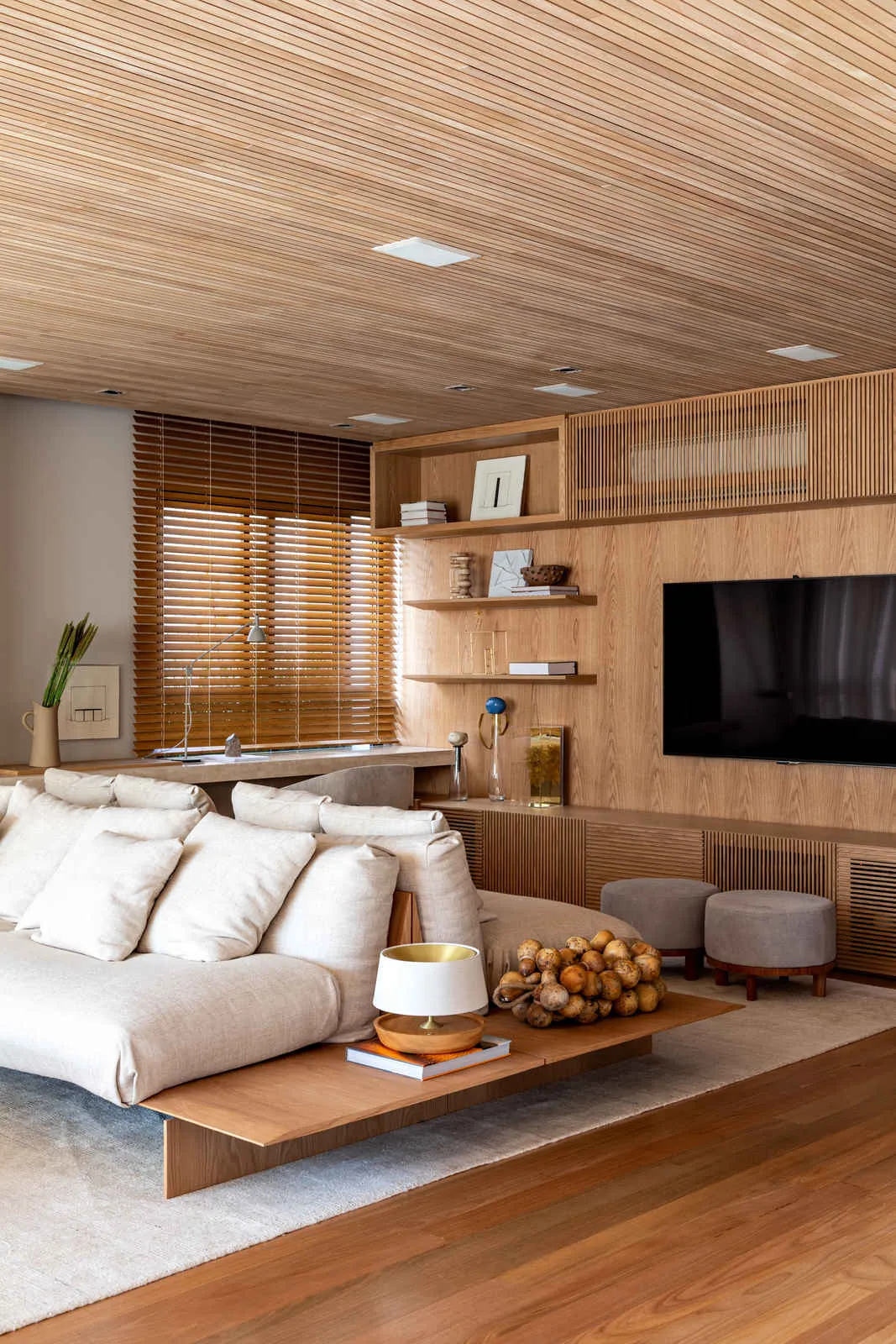
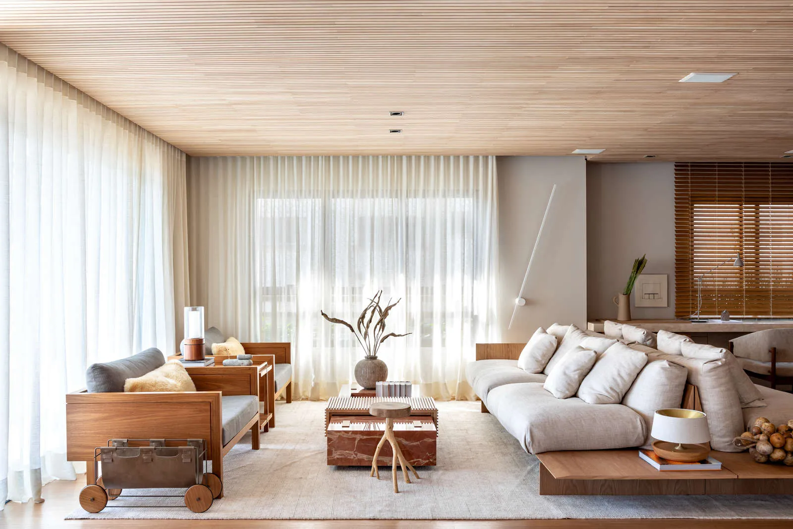
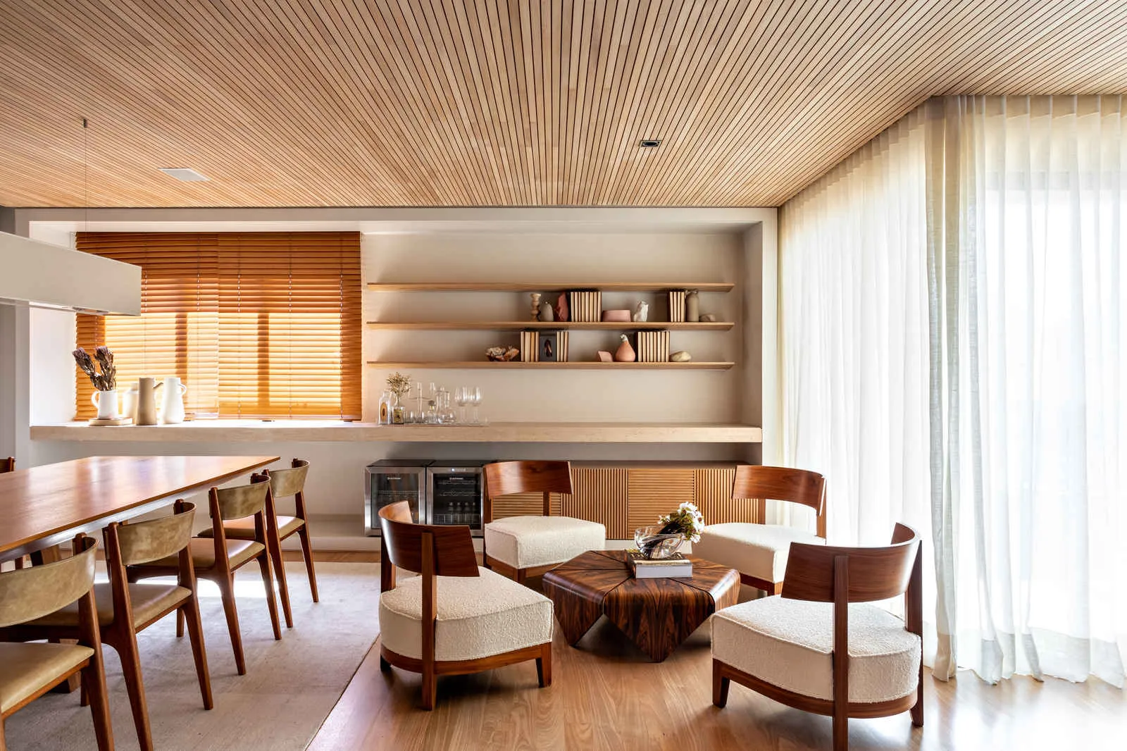
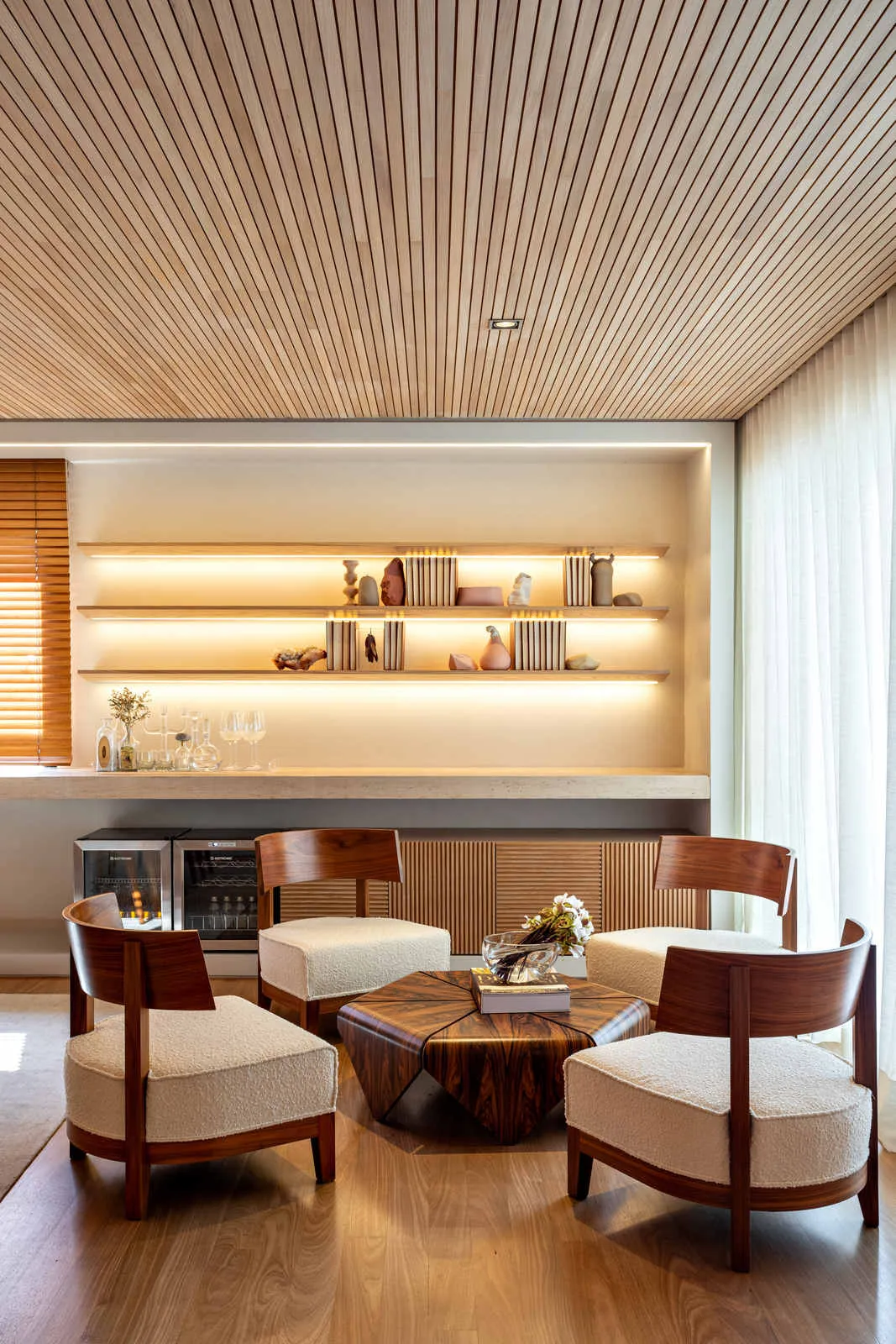
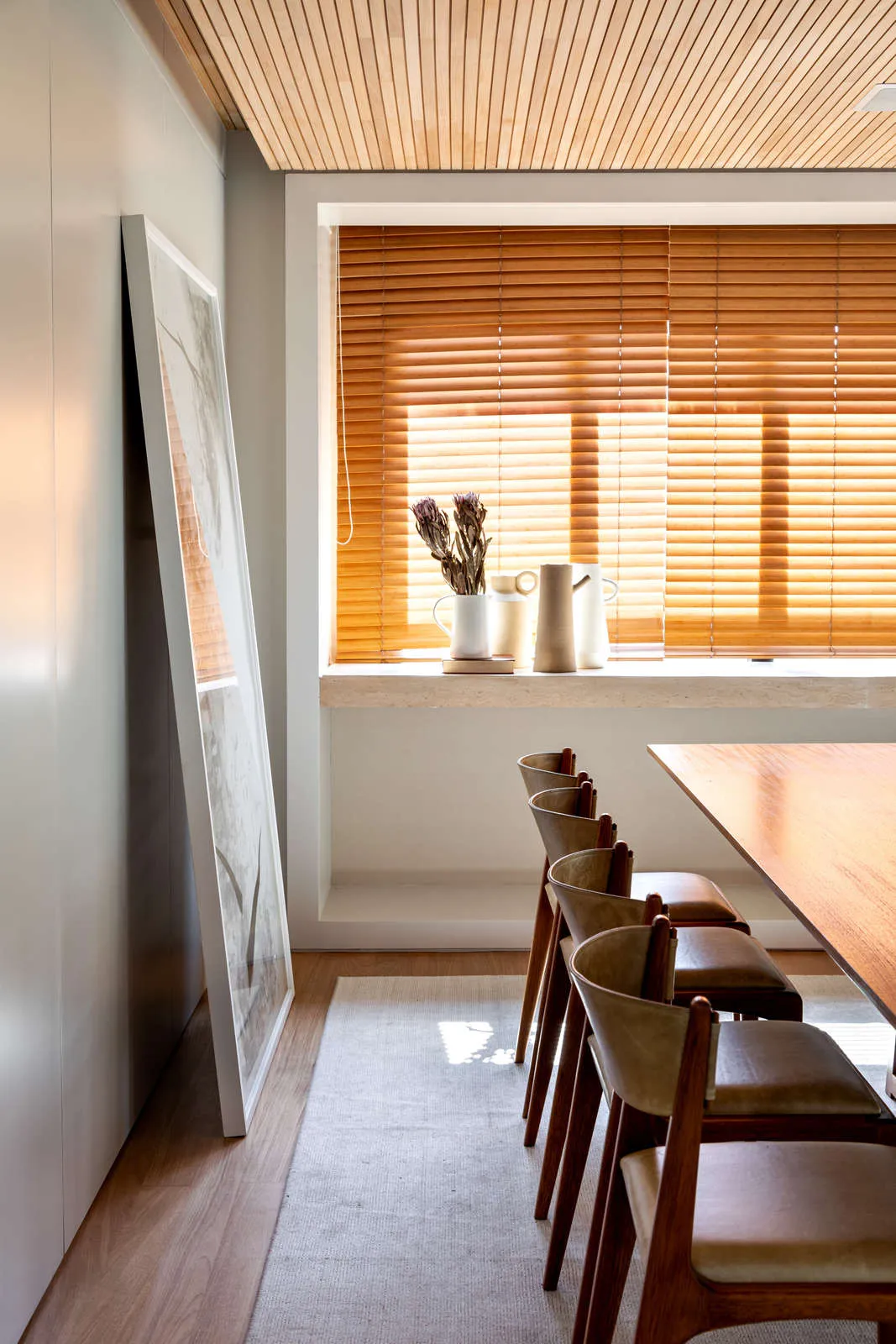
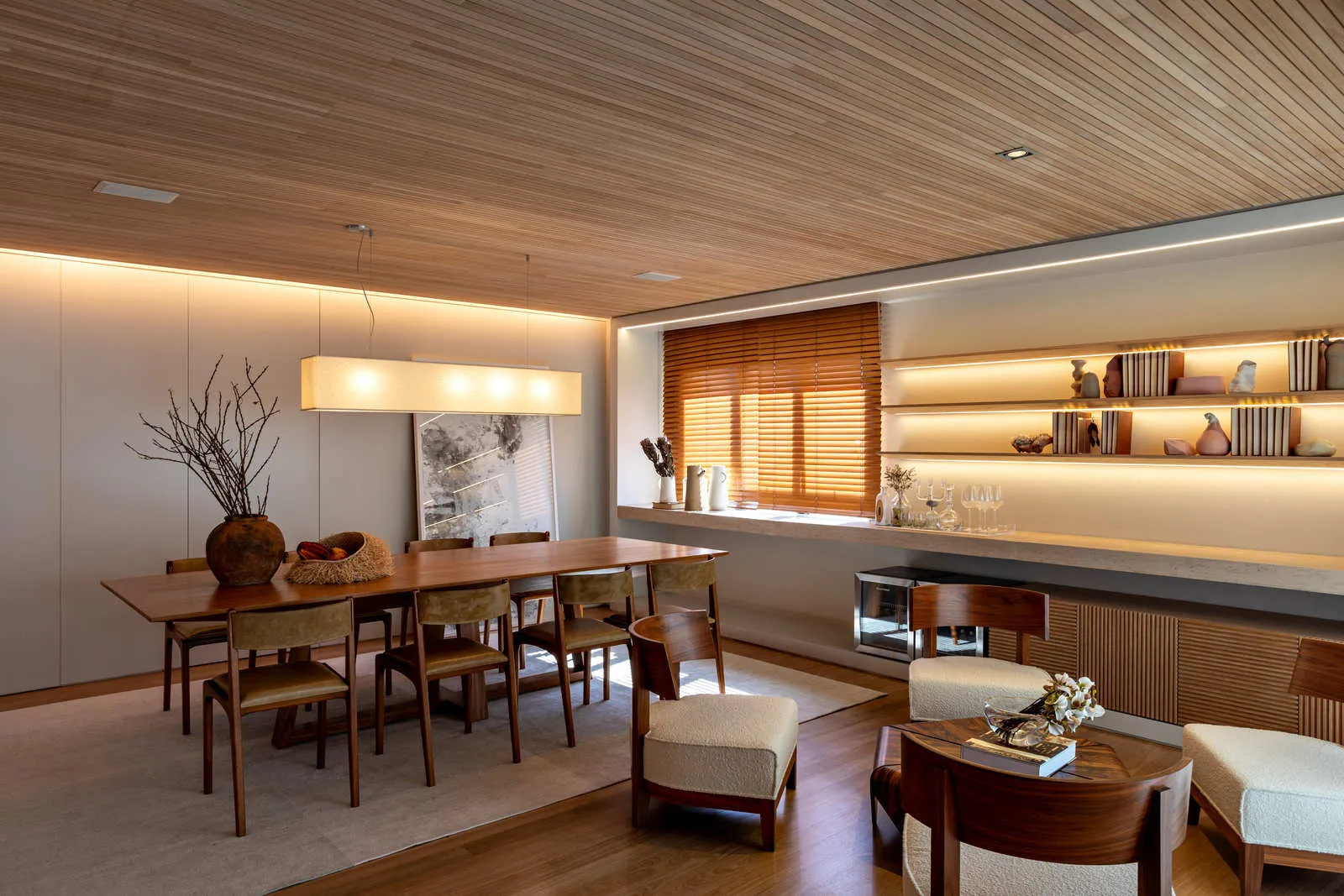
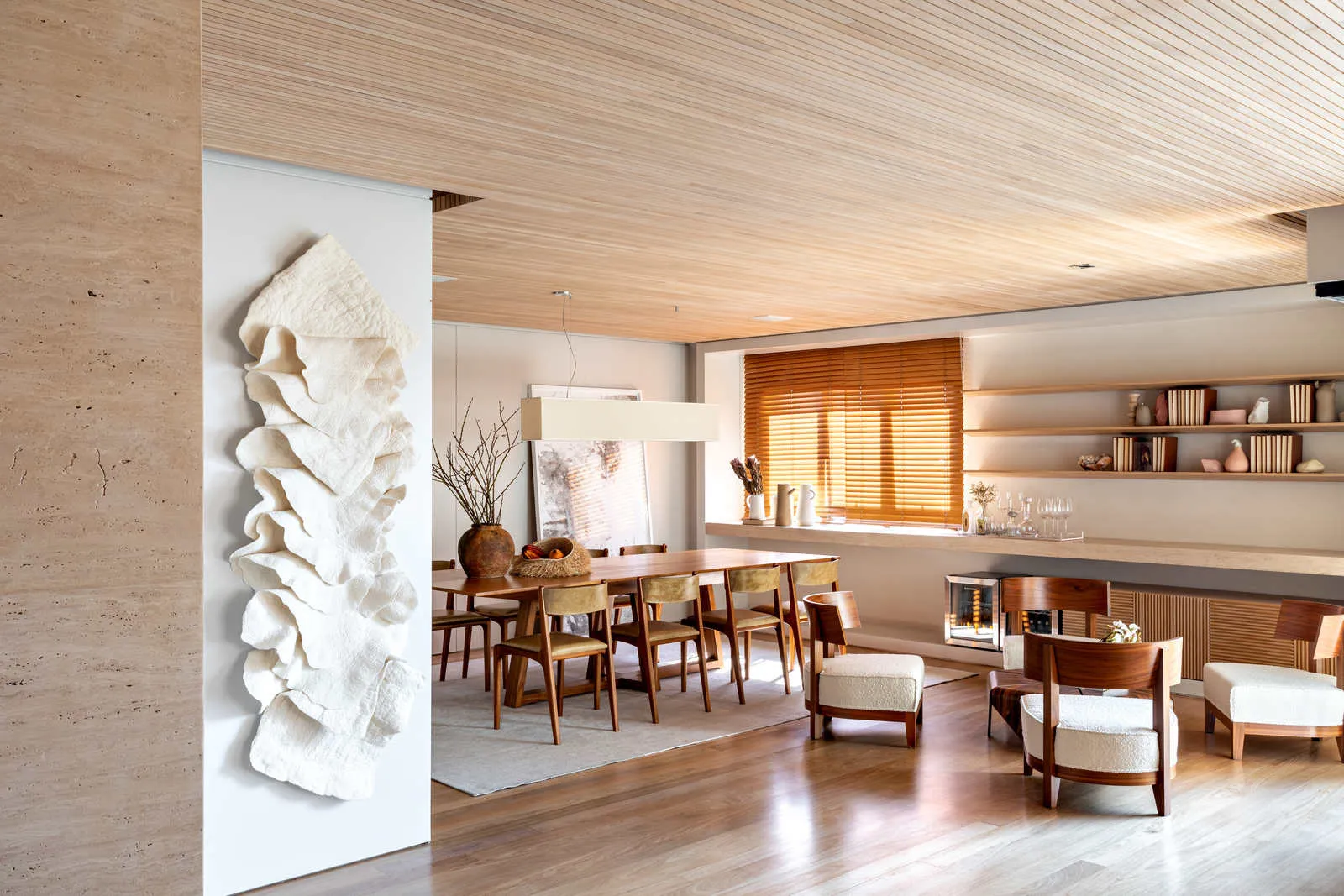
This cozy apartment full of personality was designed by the office Très Architecture and is in the neighborhood of Itaim Bibi, in São Paulo. With 170m², the architects thought of a renovation that would disable the old office and change the configuration of the common area to an integrated living room.
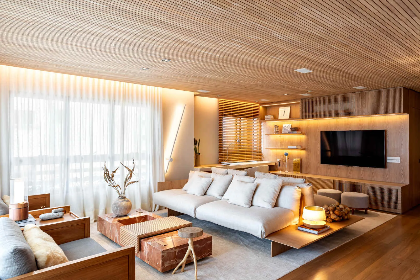
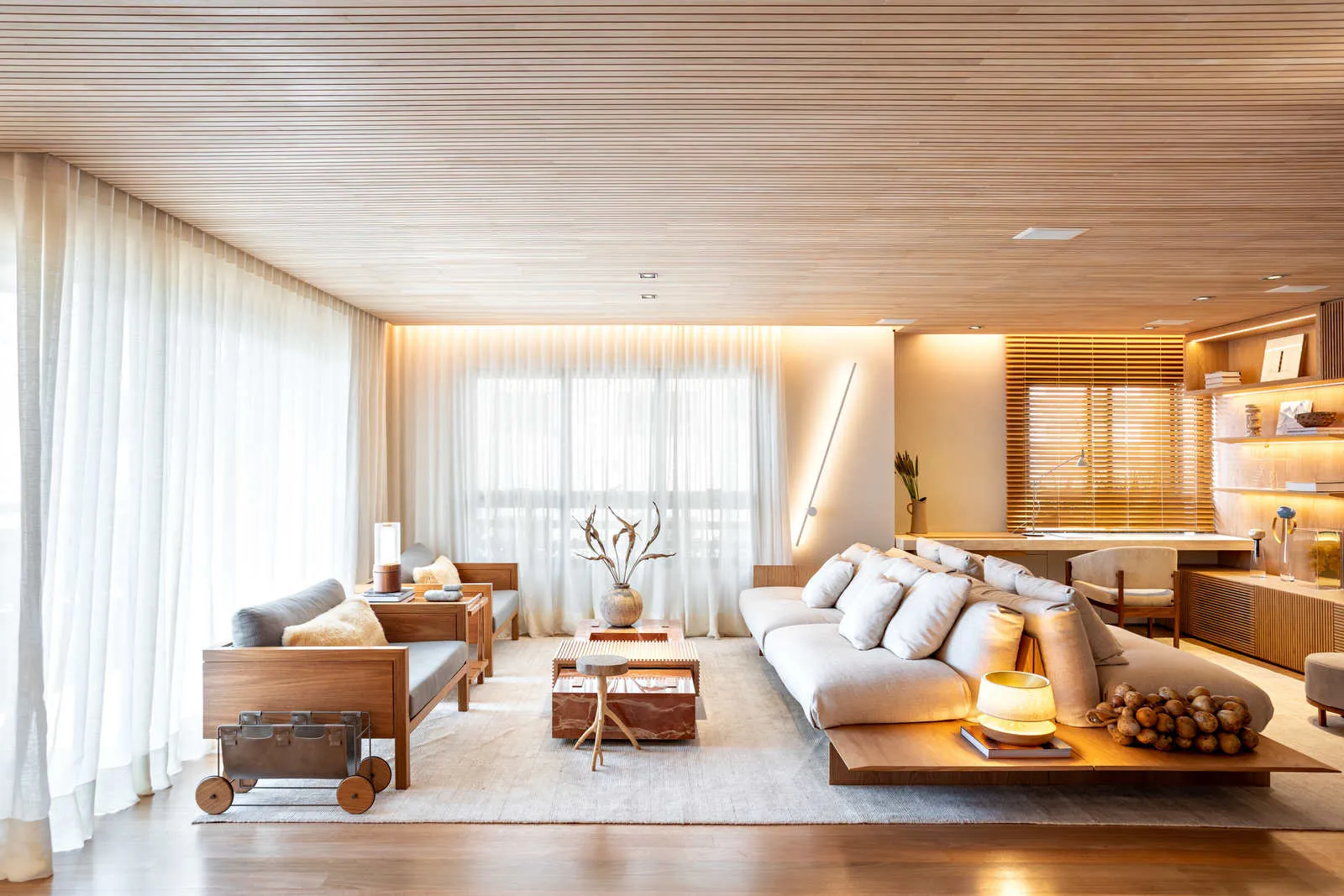
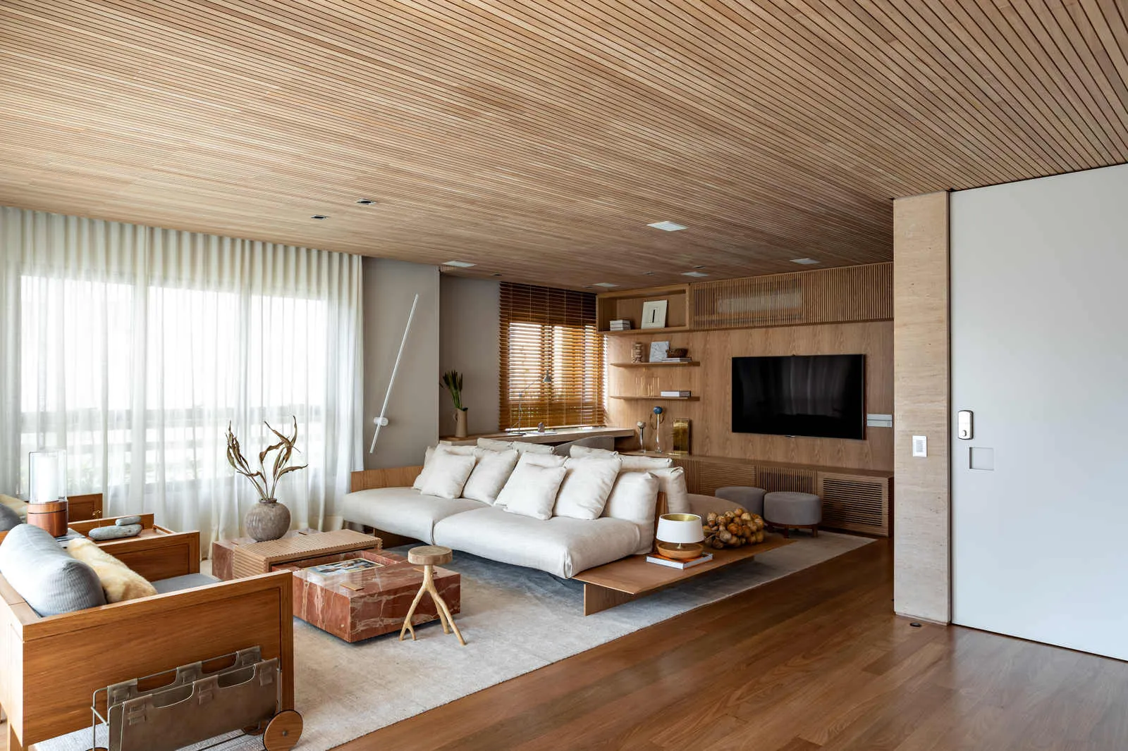
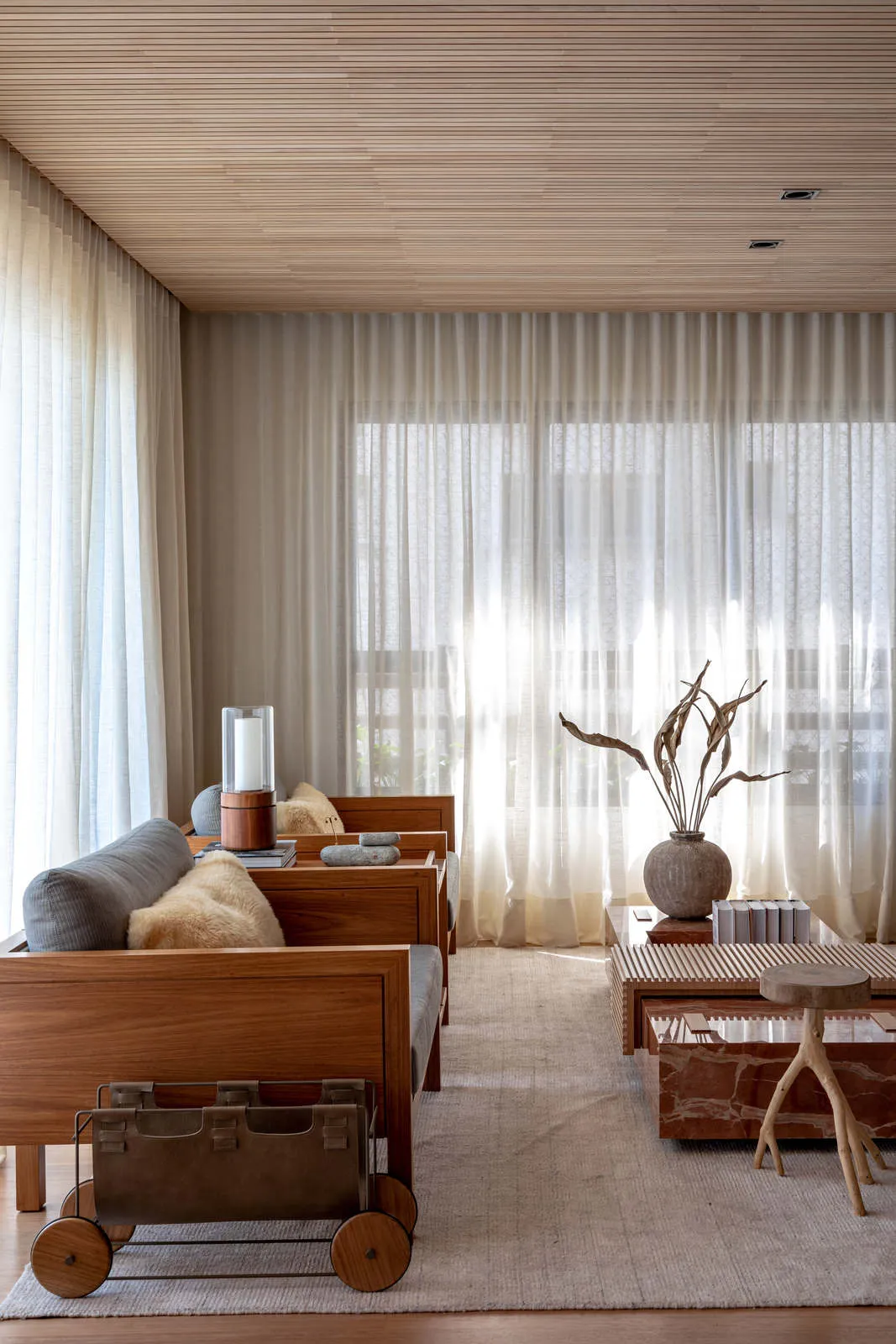
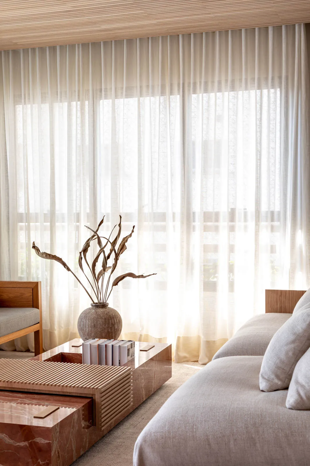
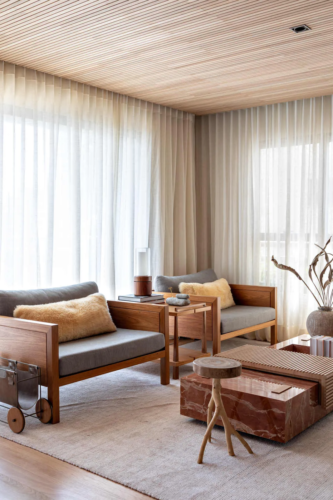
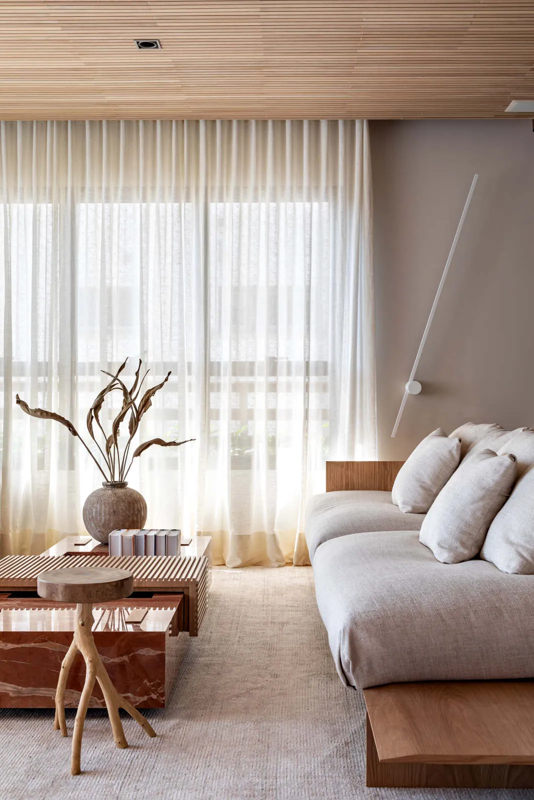
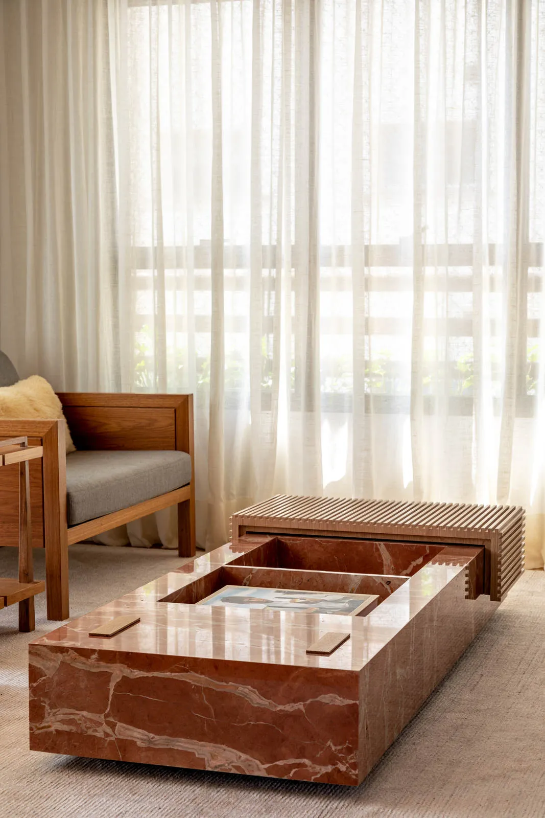
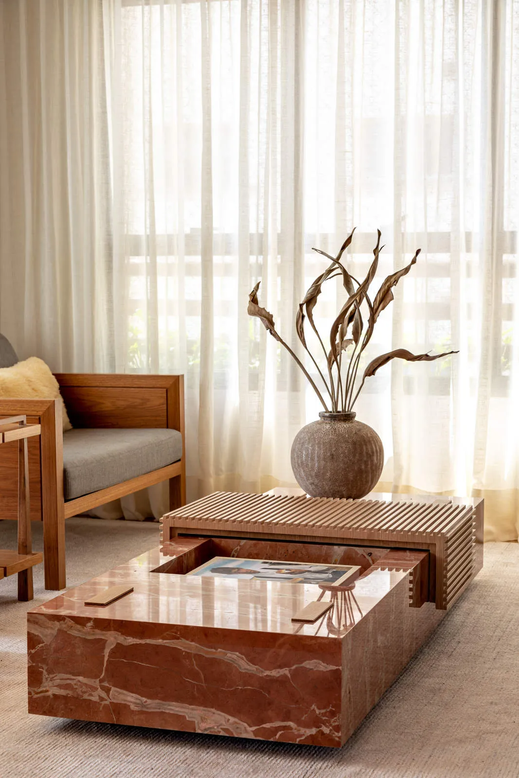
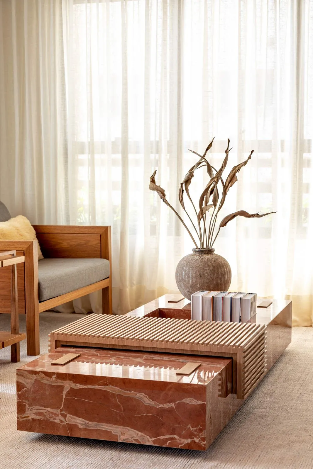
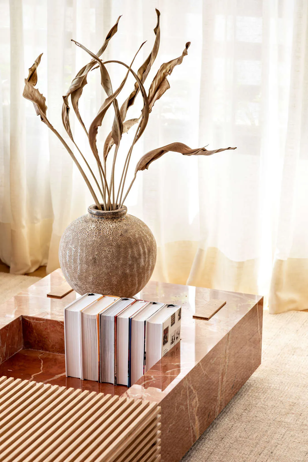
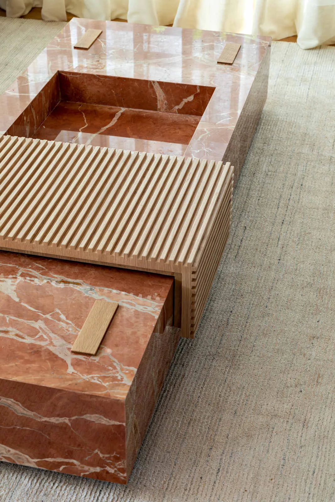
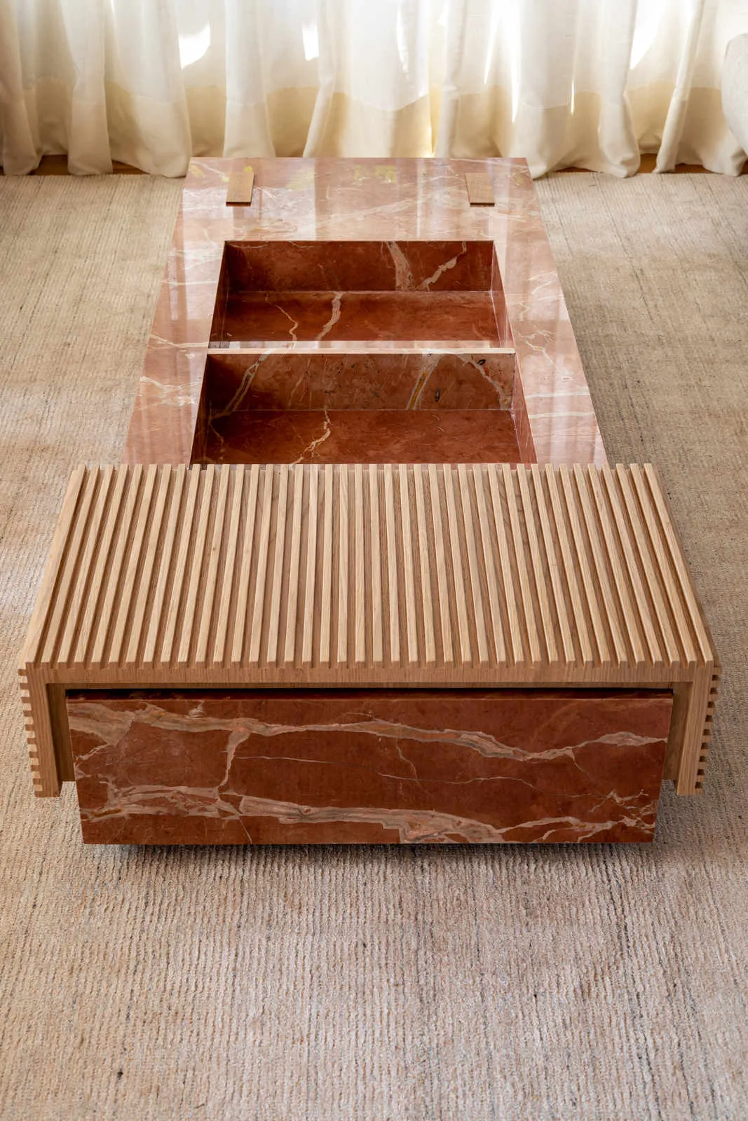
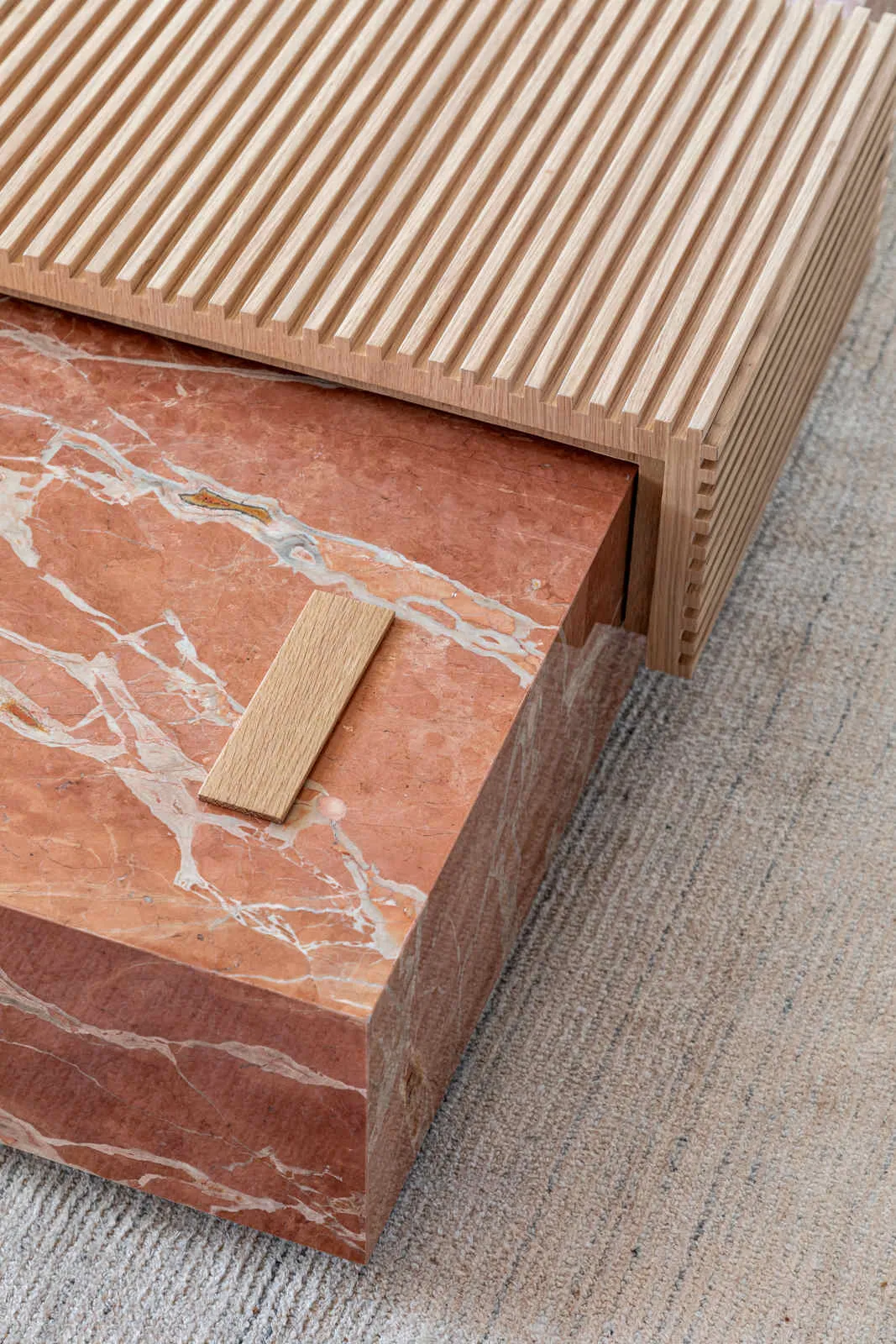
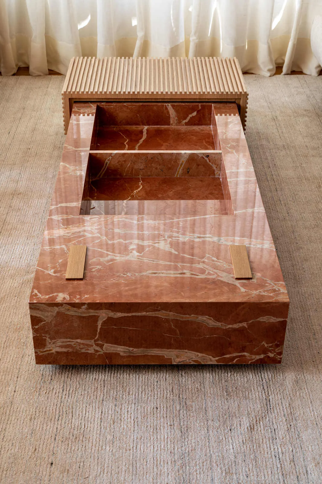
Some items stand out in the apartment, such as the marble coffee table specially designed by the office. In addition, the joinery was millimetrically designed to embrace the spaces and further highlight the characteristics of the integrated living area. In the channel you can check out the complete tour with Fernanda Morais, one of the partners of the office, and here a conversation with her telling more curiosities about the project.
Valentina’s House: What were the main wishes of the clients for the renovation?
Fernanda Morais: “They were pregnant with their second daughter and wanted to give a little room as a gift to their eldest daughter. In addition, they wanted to disable the old office and change the configuration of the common area to an integrated living room.”
CV: And how was office space rethought?
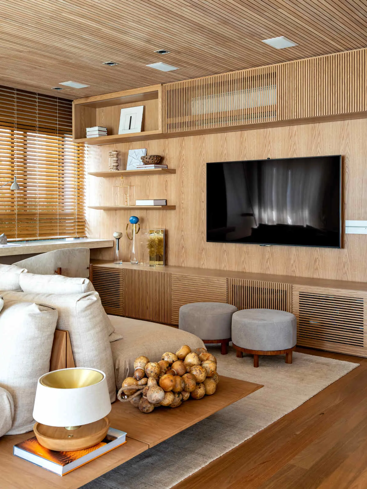
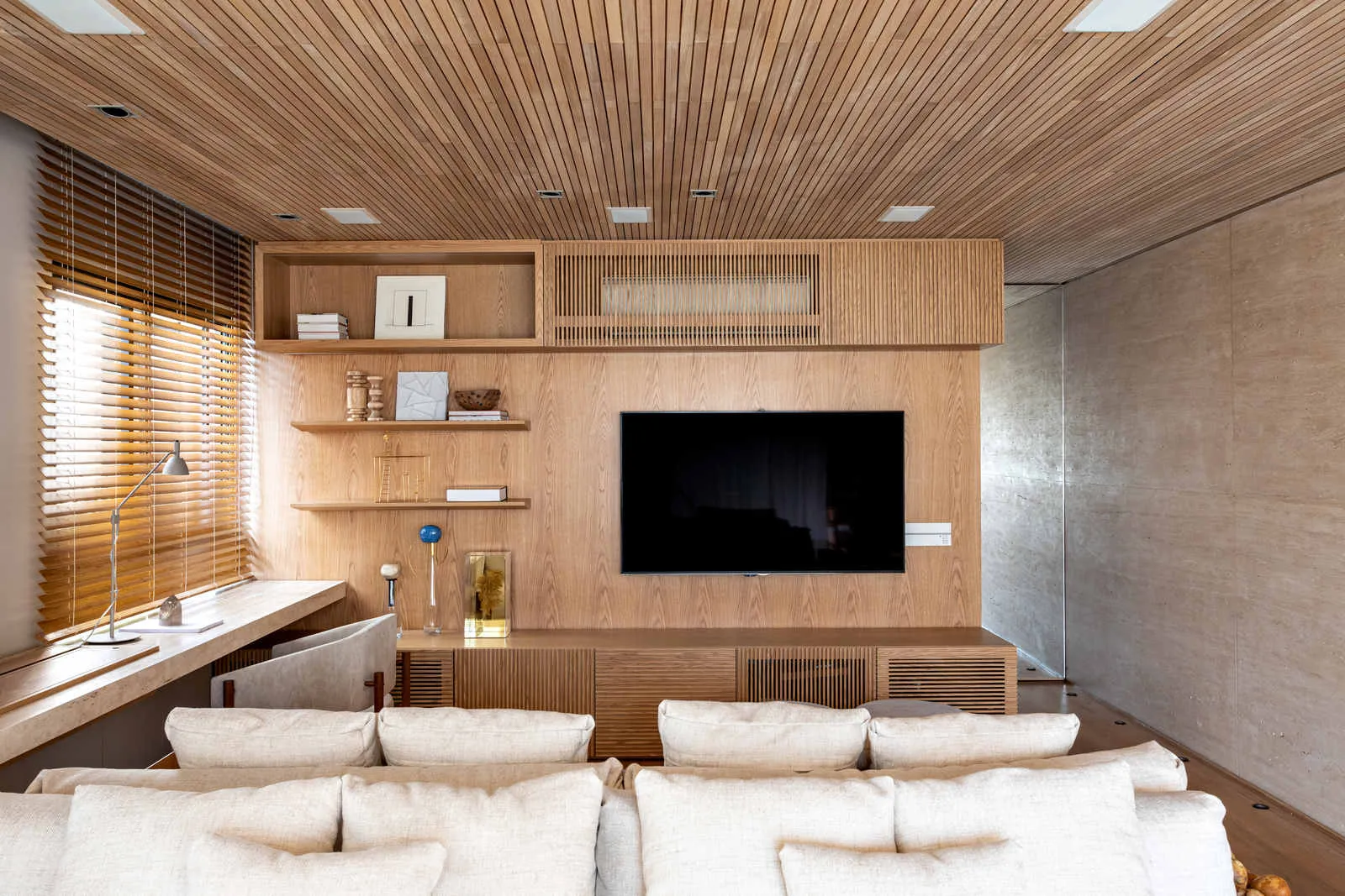
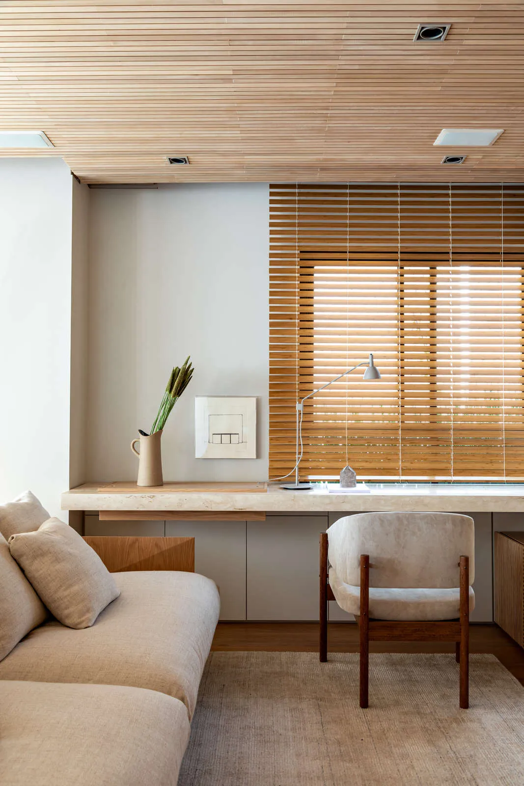
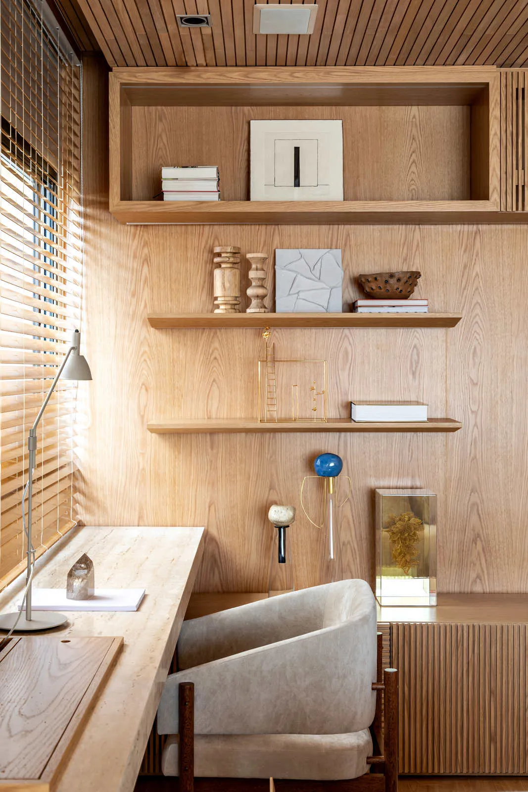
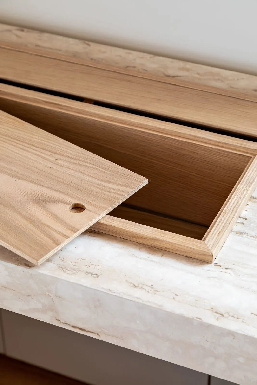
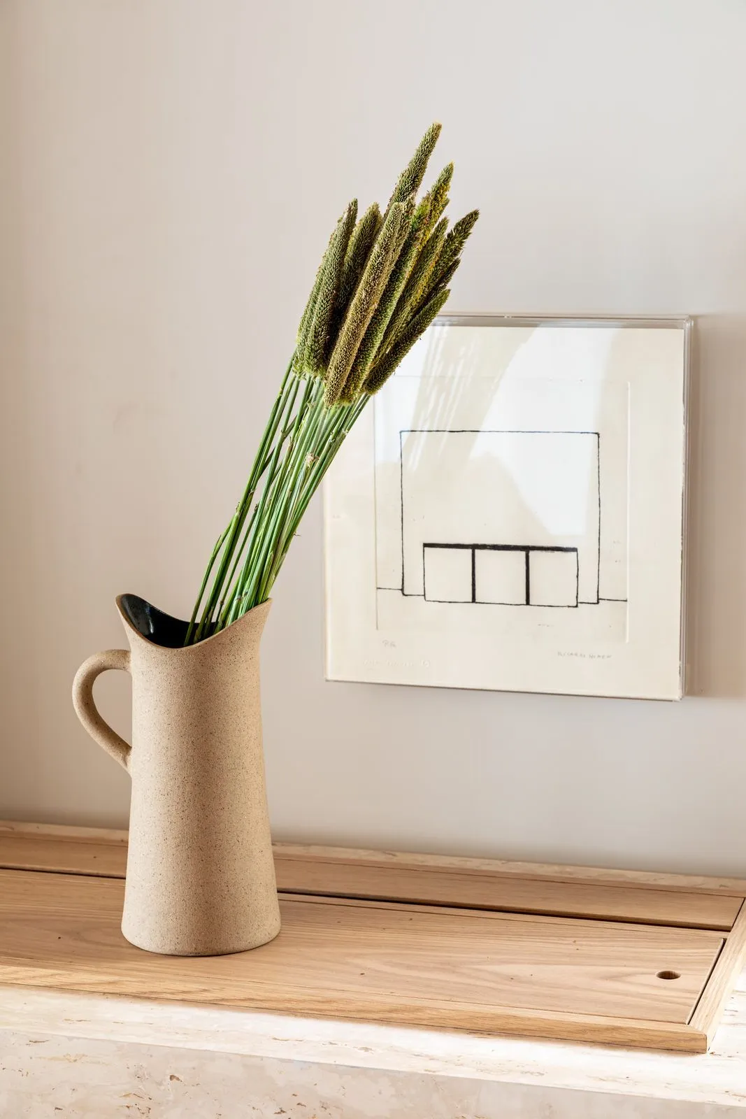
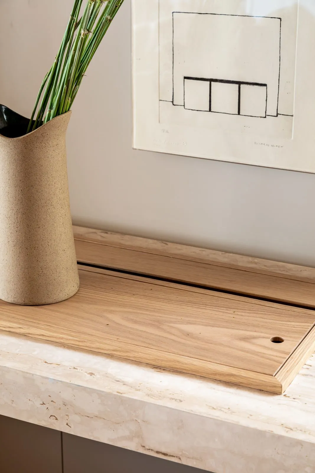
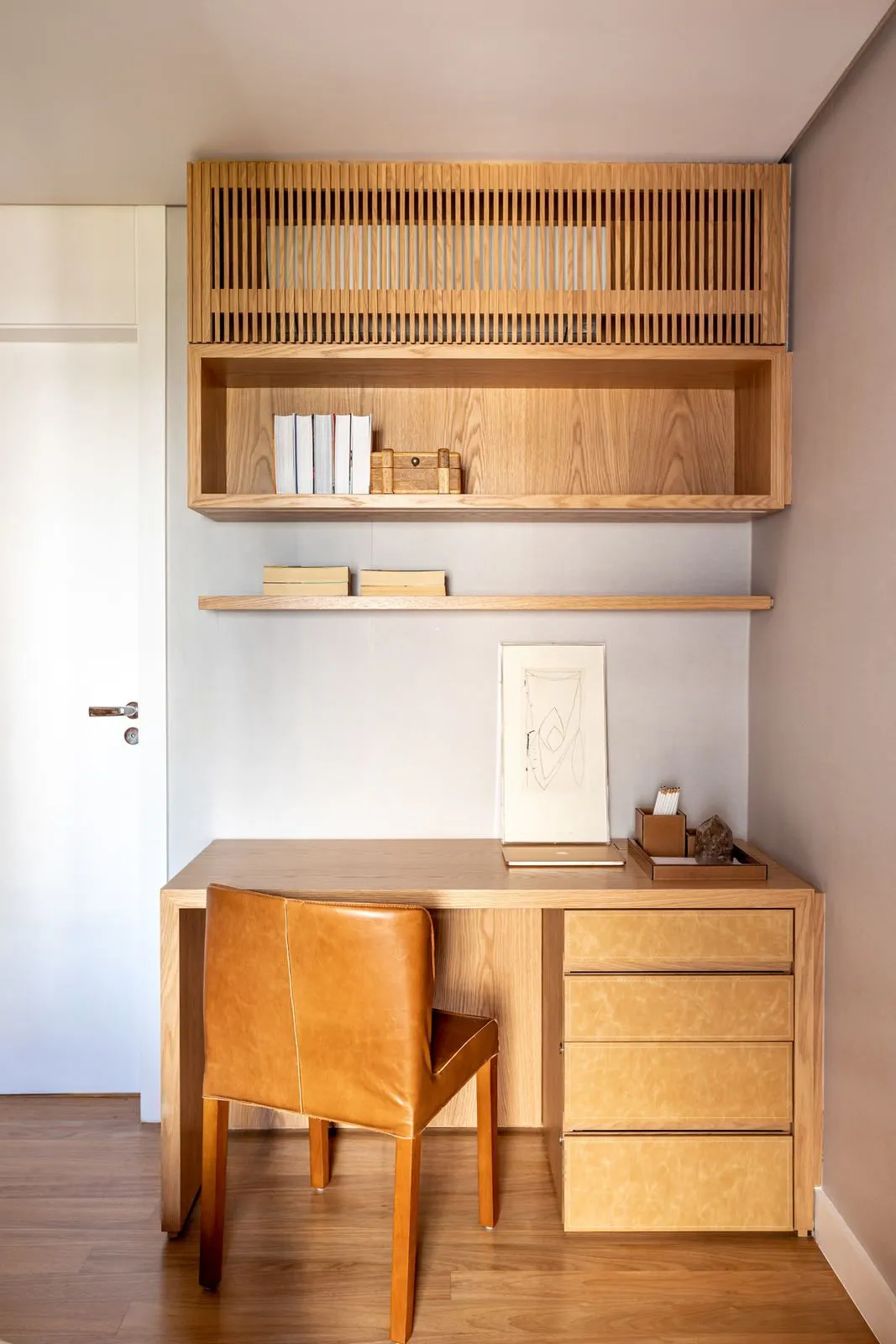
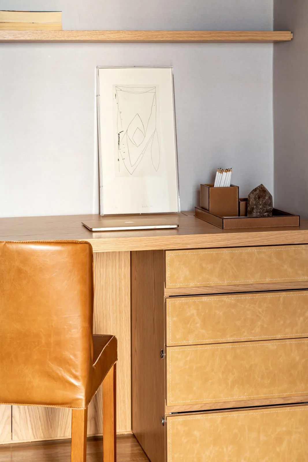
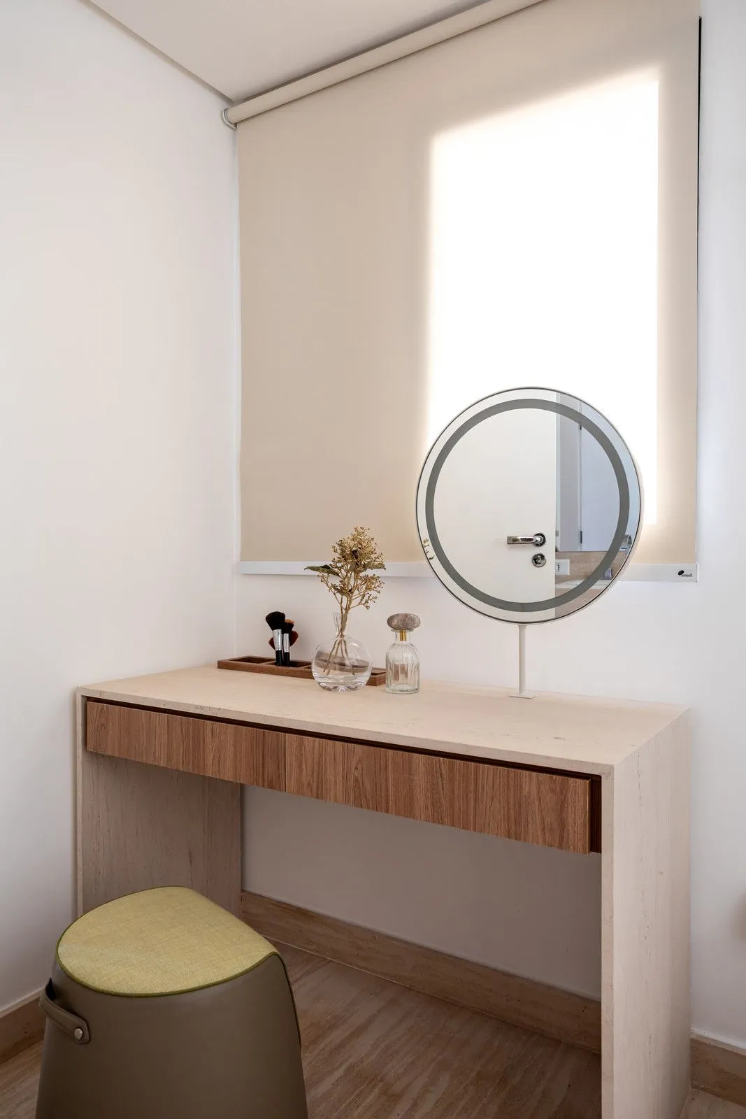
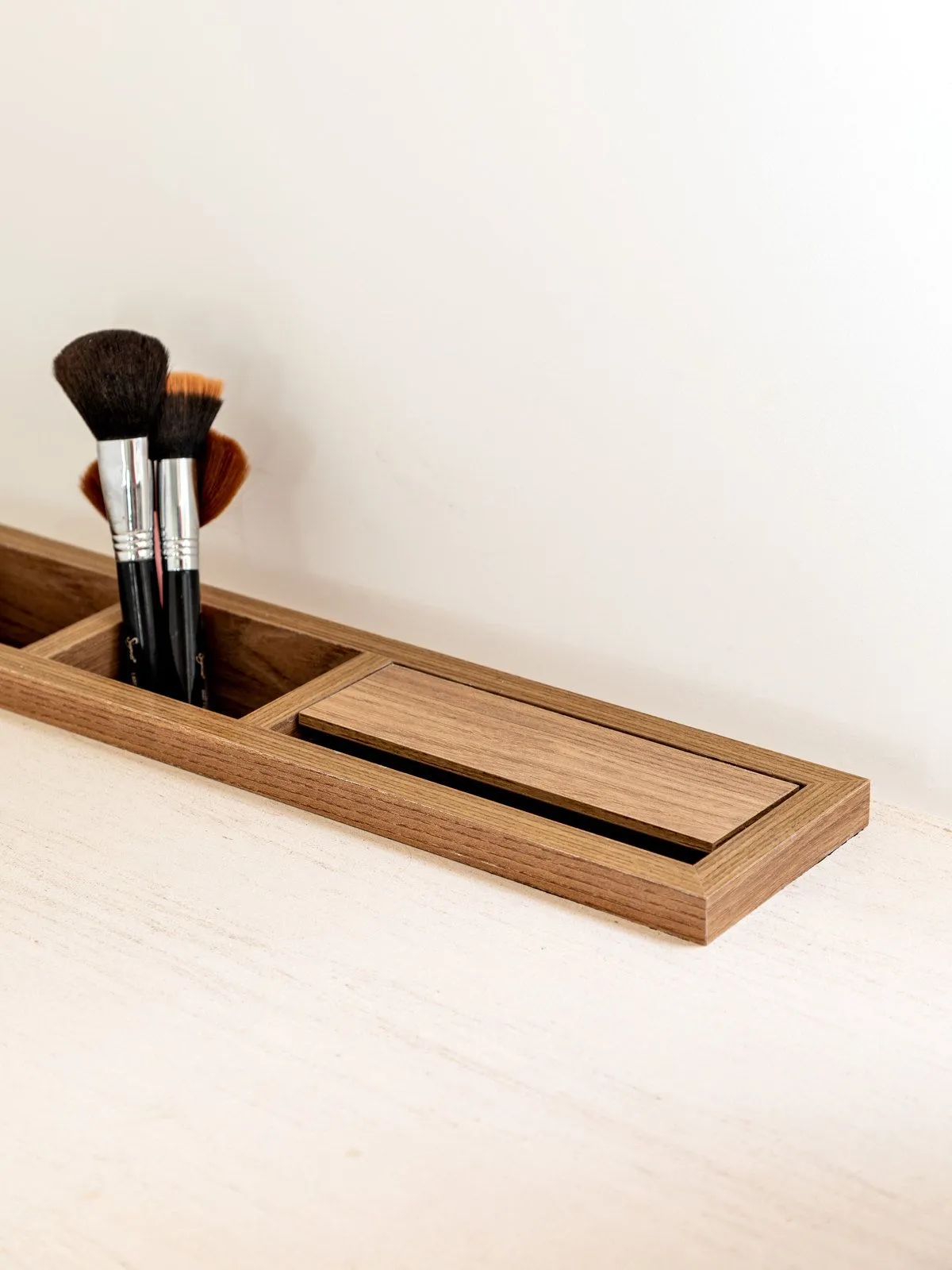
Fernanda Morais: “They wanted a workspace in the room, so we planned a multipurpose room that has a home theater, the living room and a home office support bench that is aesthetically interesting enough to live with the rest of the social area. And the marble coffee table was specially designed by us for this project. They didn’t need much space to store things on the marble countertop, so we only created a wooden box for when they are receiving. In this box they can leave the drinks, serve as a support to serve some snacks or, eventually, even desserts. So the ‘normal’ countertop can become a bar countertop.”
CV: How was the color palette of the children’s room designed?
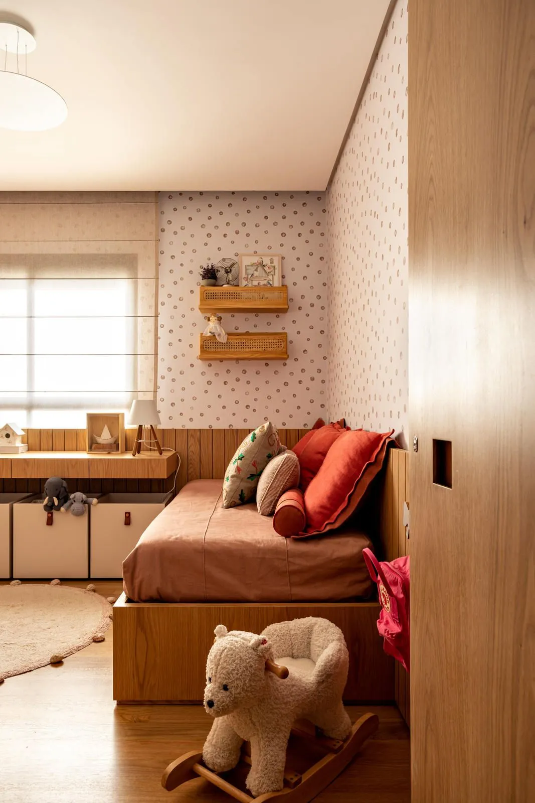
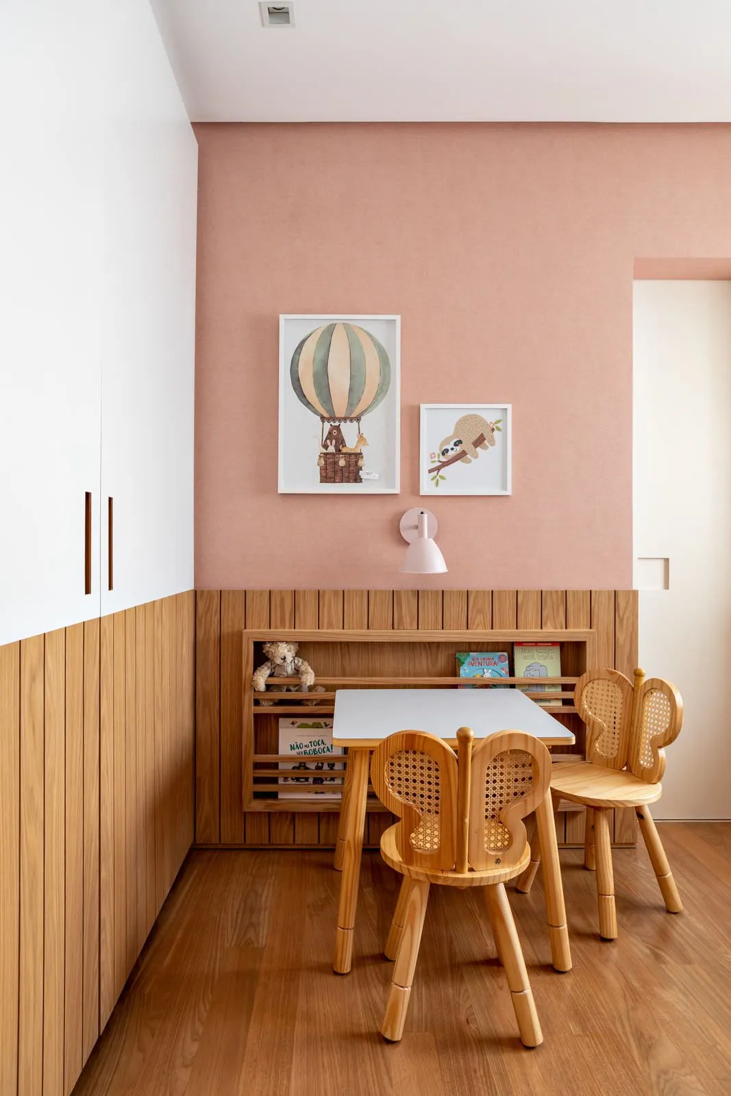
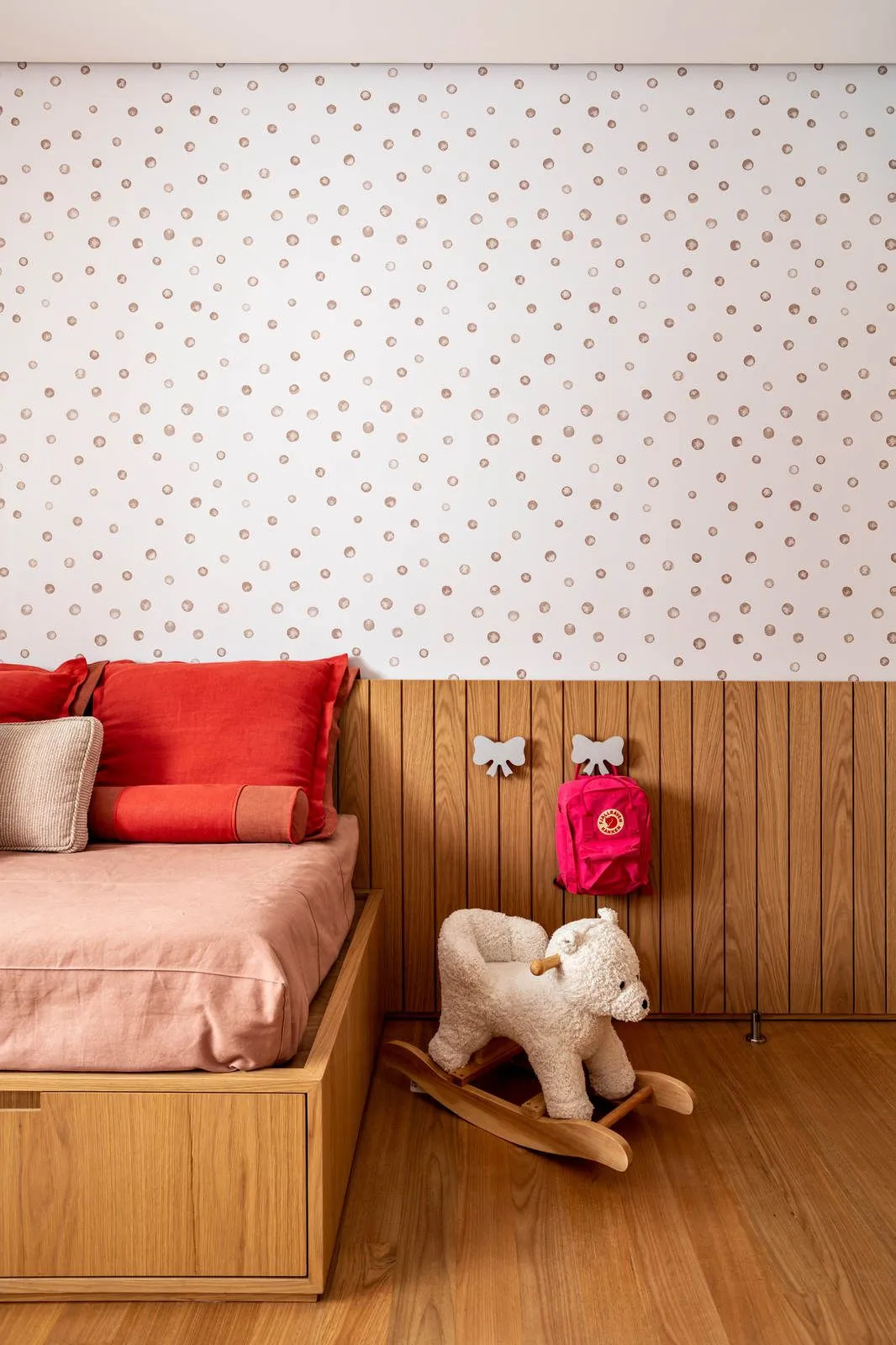
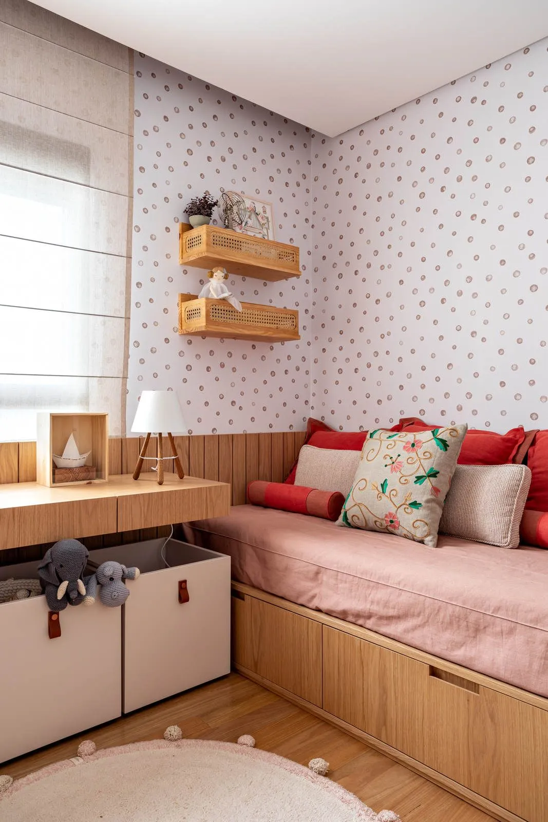
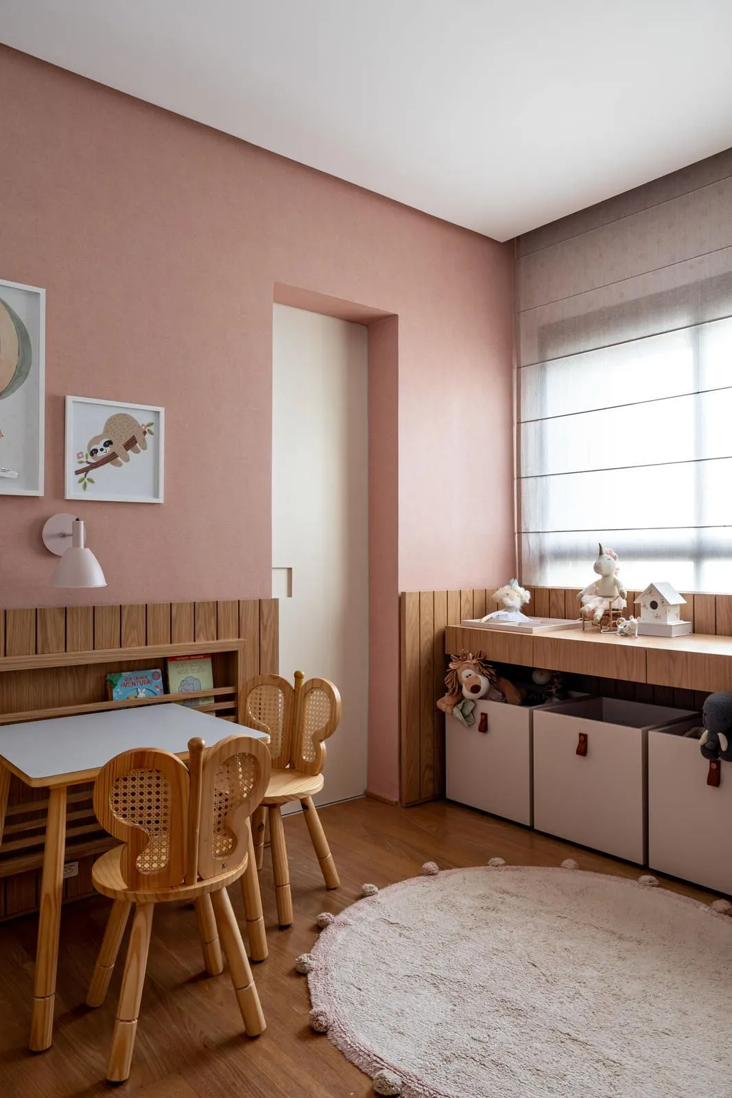
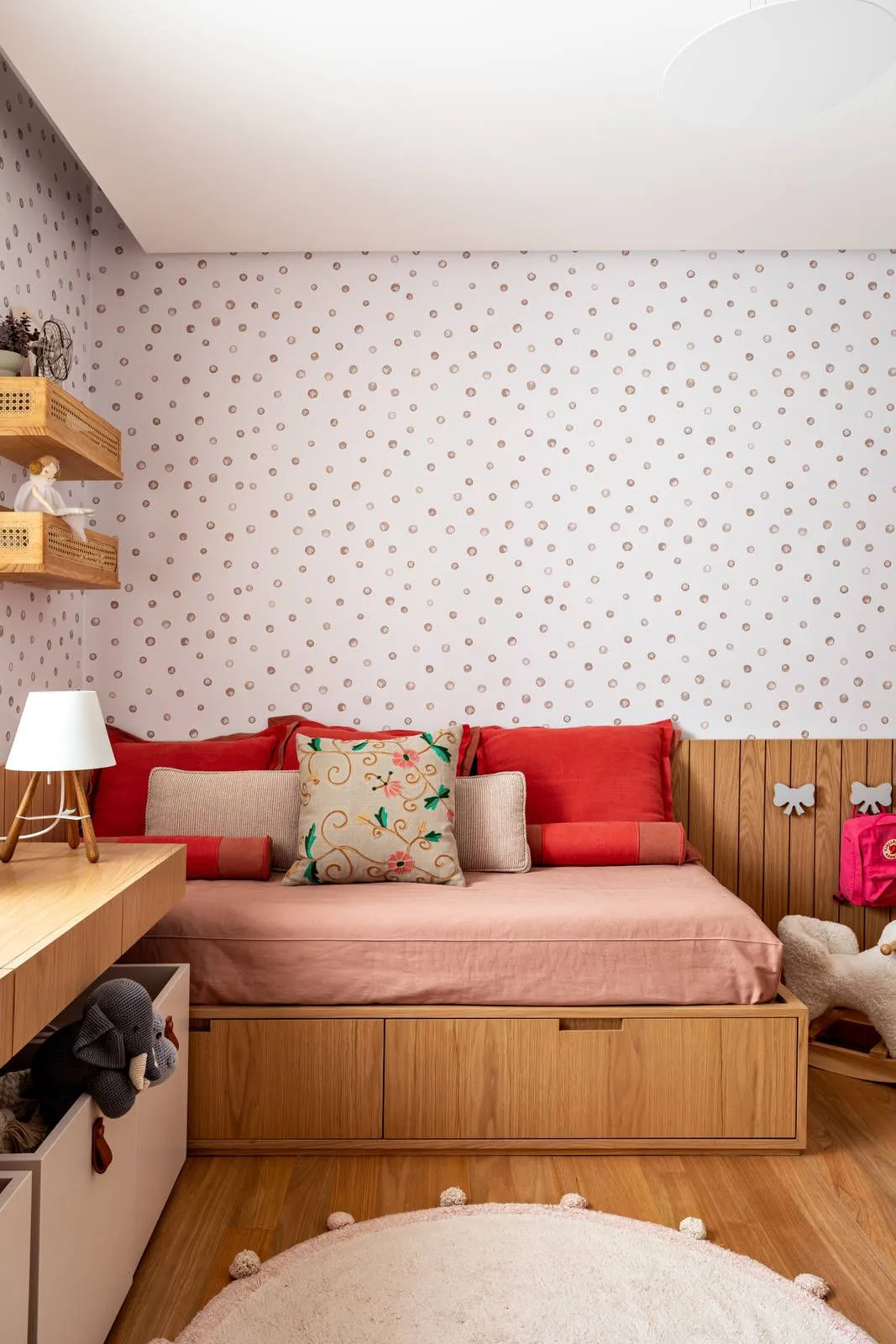
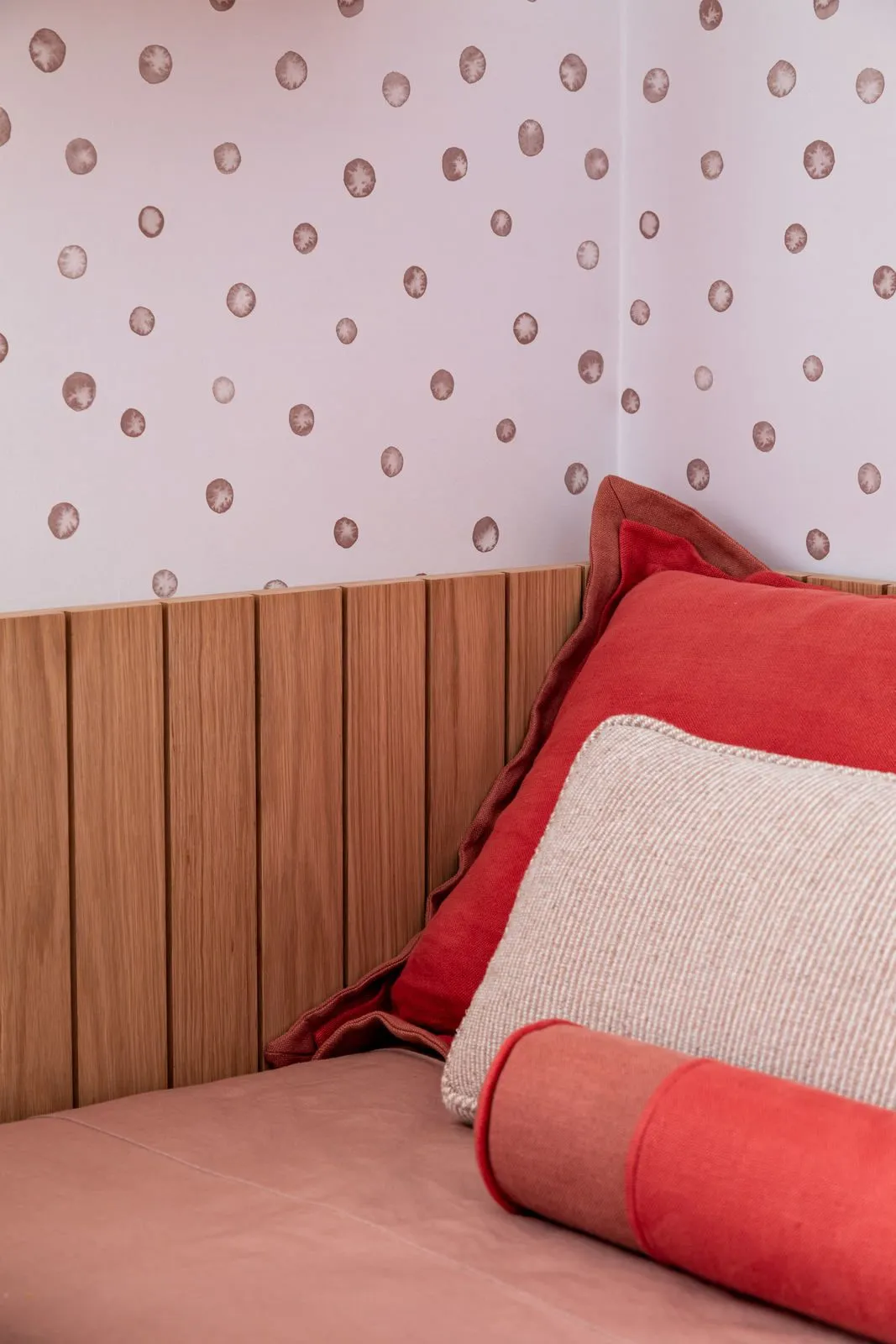
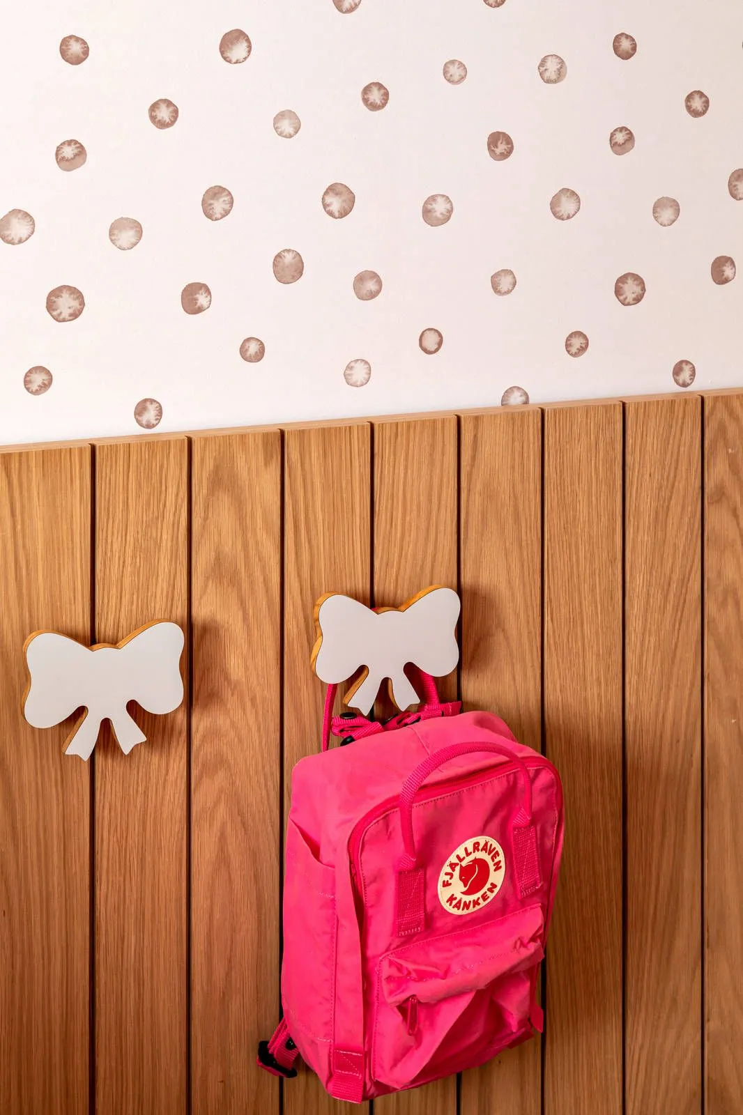
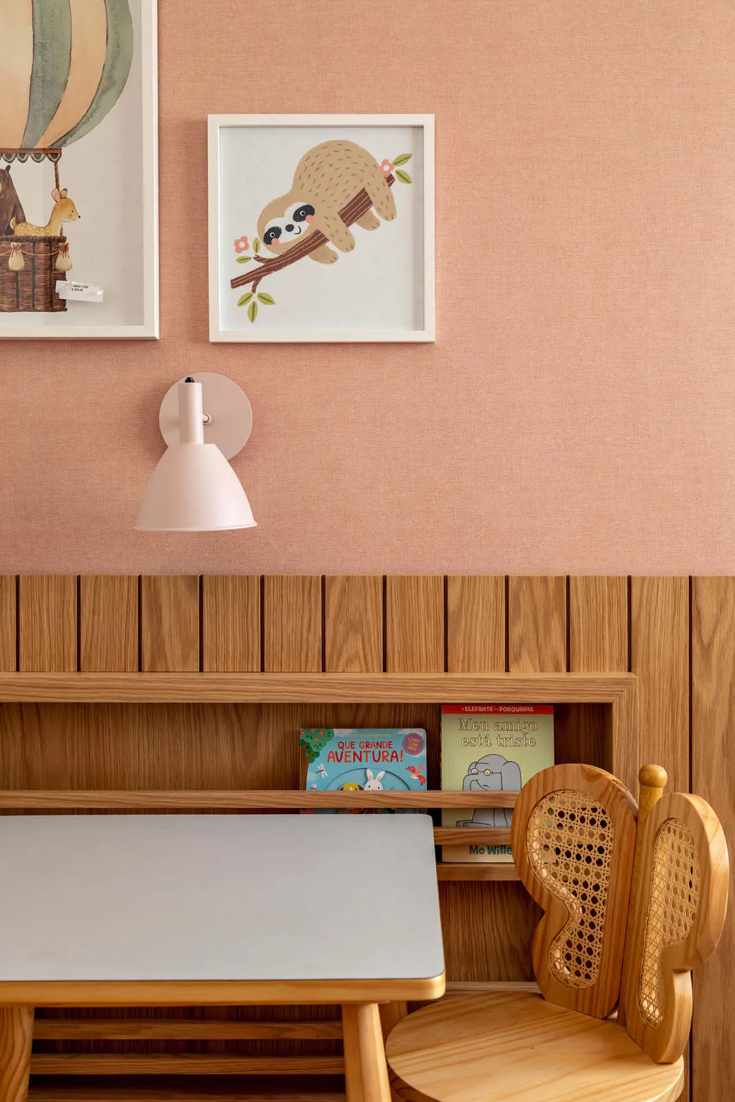
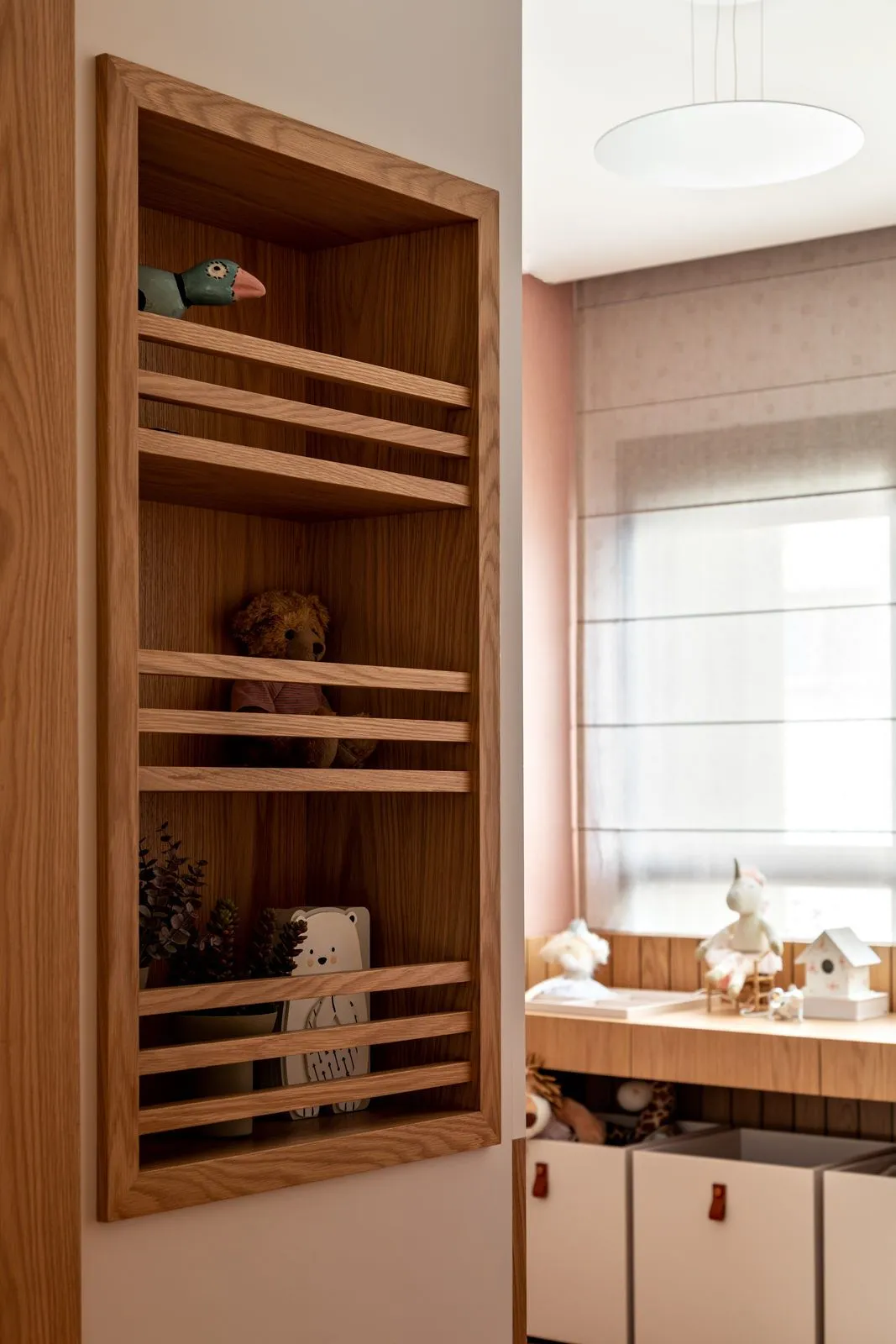
Fernanda Morais: “We use a shade of pink, but with a somewhat unusual mixture. It is a dry pink that mixes with a very lively and cheerful coral color. We did this to bring a different composition to the shade of pink. We also worked with two different wallpapers, one of polka dots and the other pink.”
CV: What was the main premise of the room?
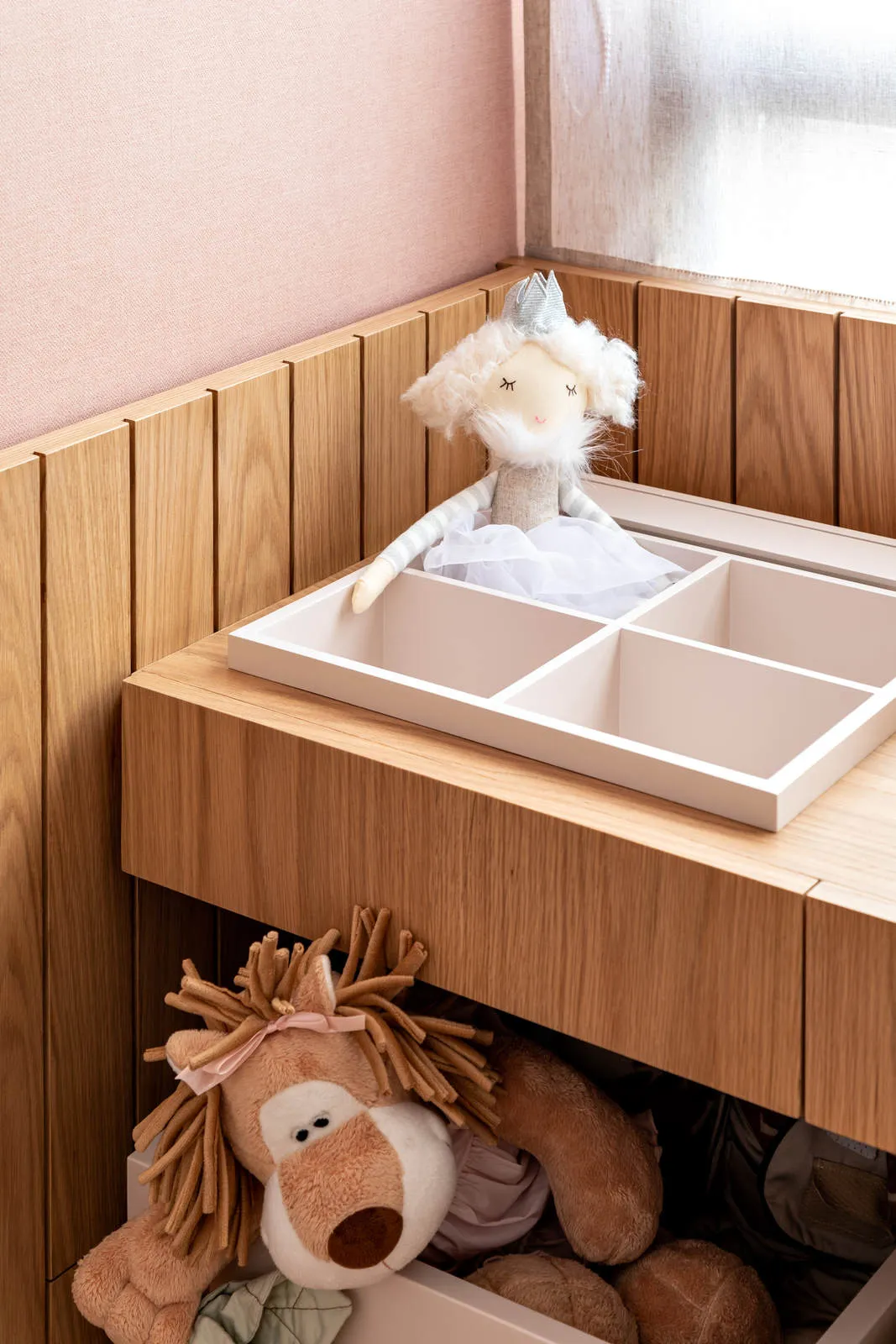
Fernanda Morais: “The idea was to design a room that could grow with her. We made a tailor-made joinery, where we left designed a study bench with adult height and, underneath, some caster boxes that are easy for the girl to pull, play and store the toys alone.”
CV: Was the woodworking of the project designed by you?
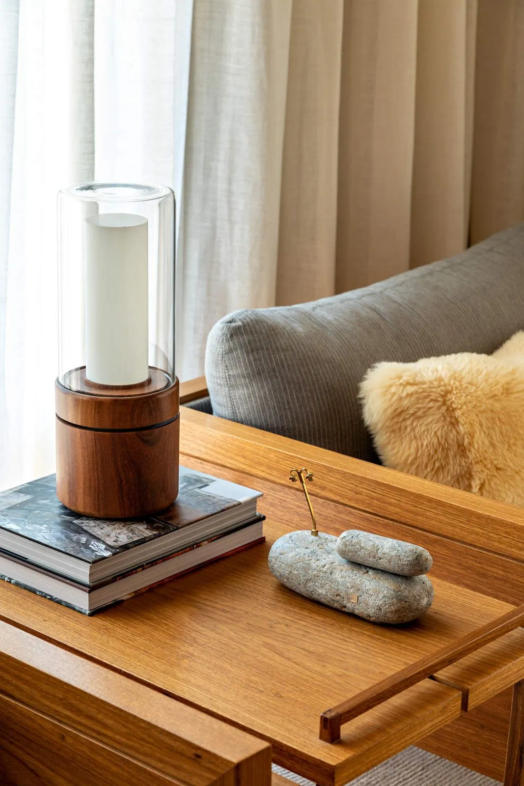
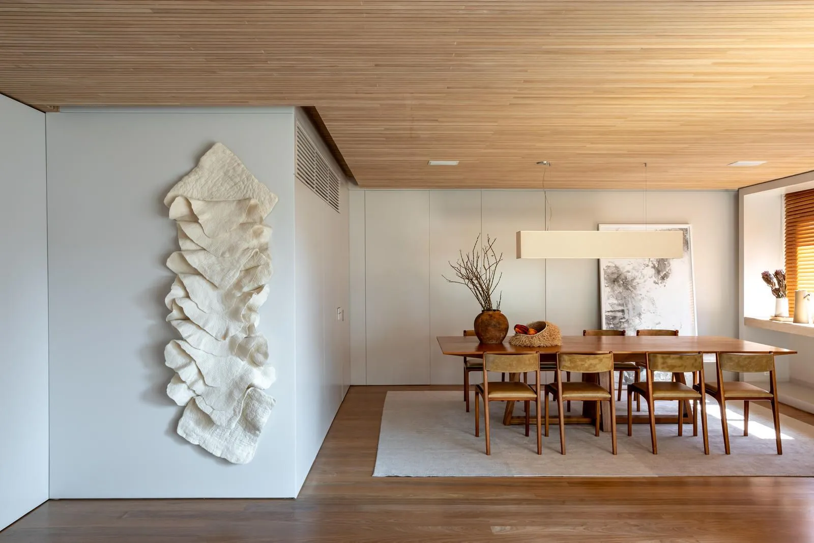
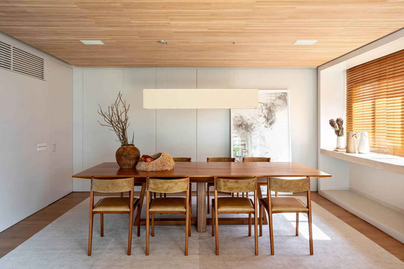
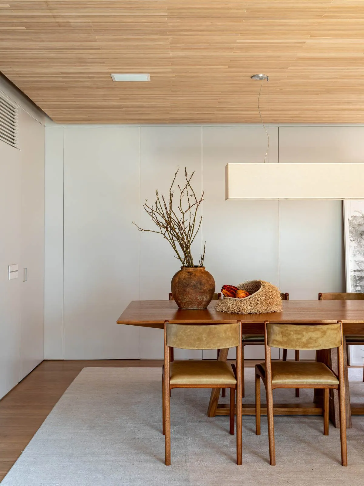
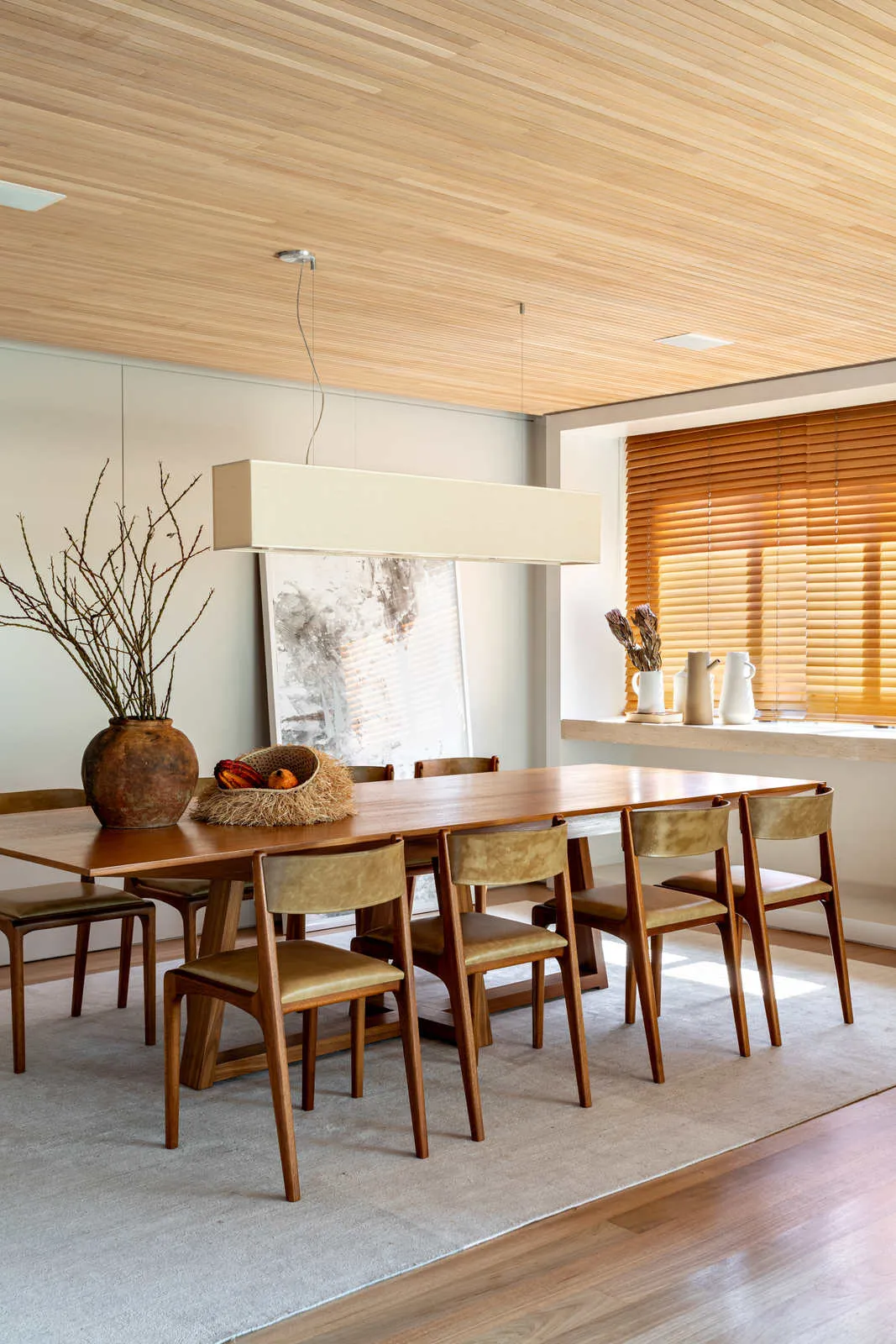
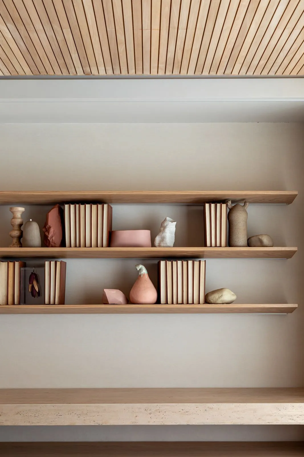
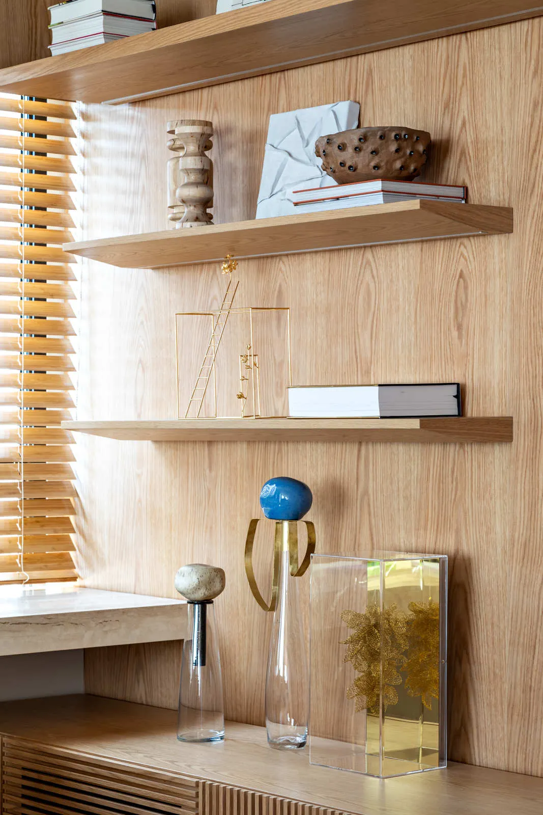
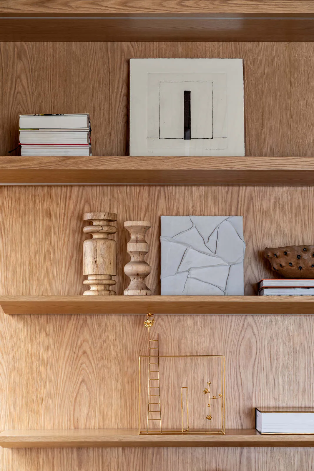
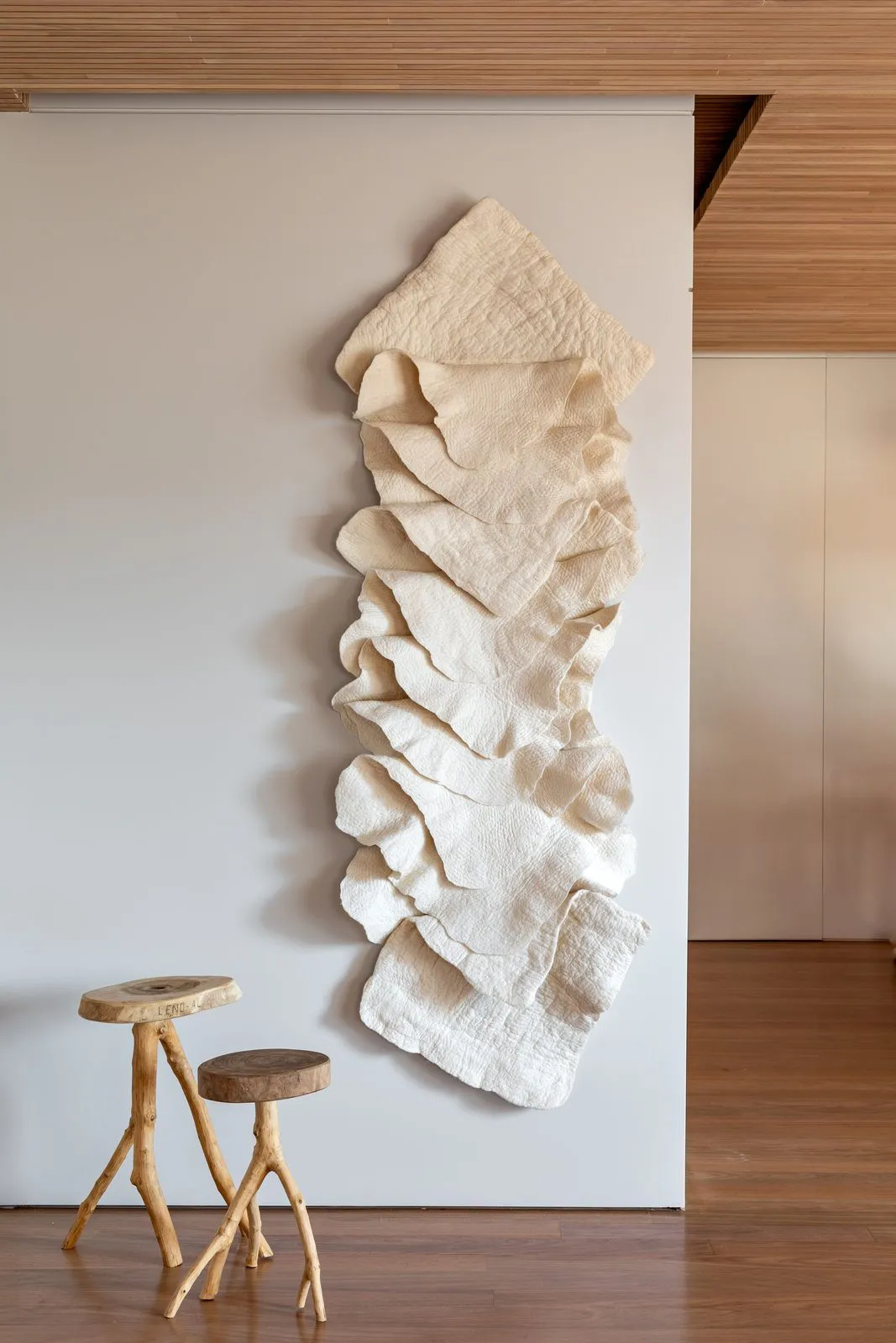
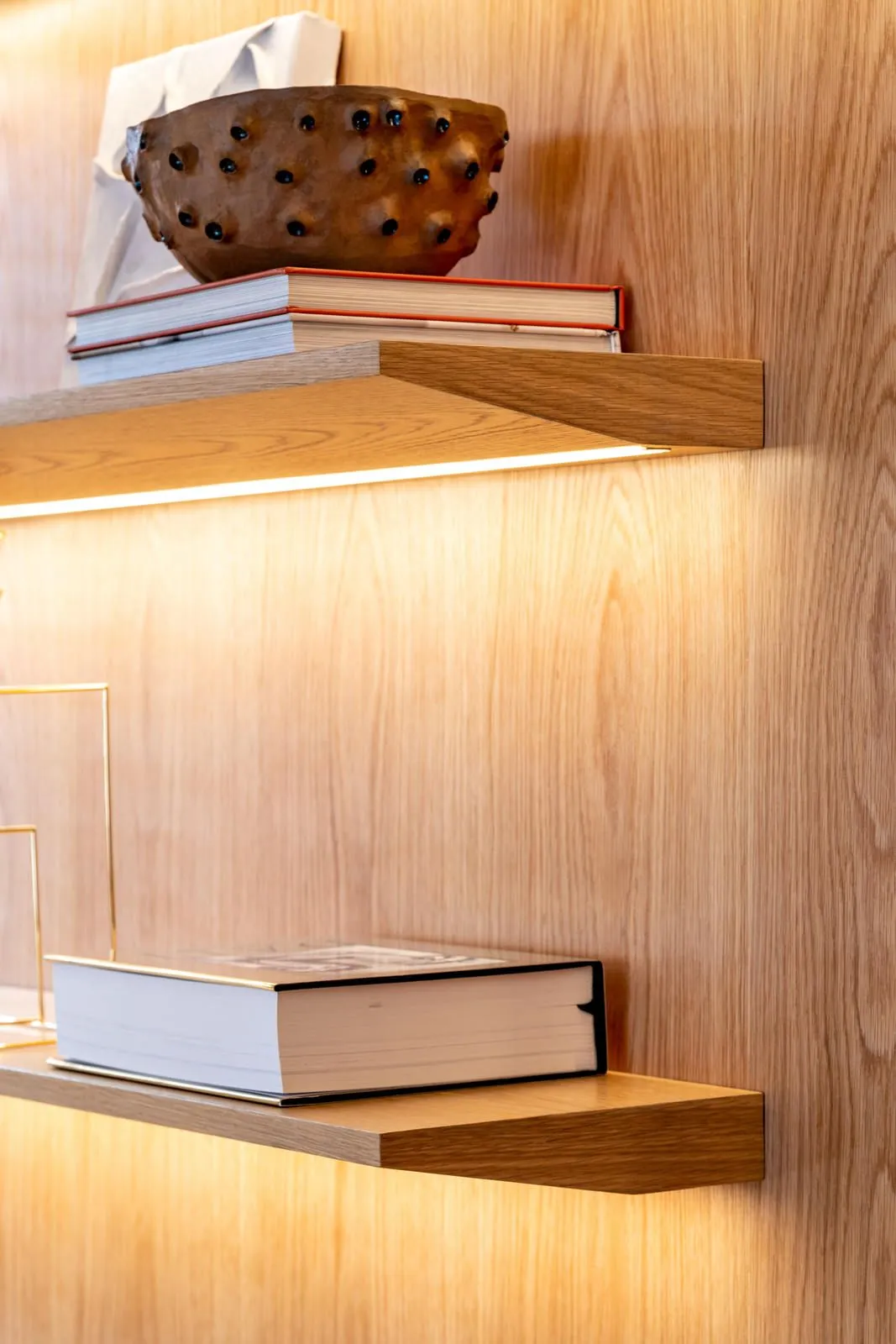
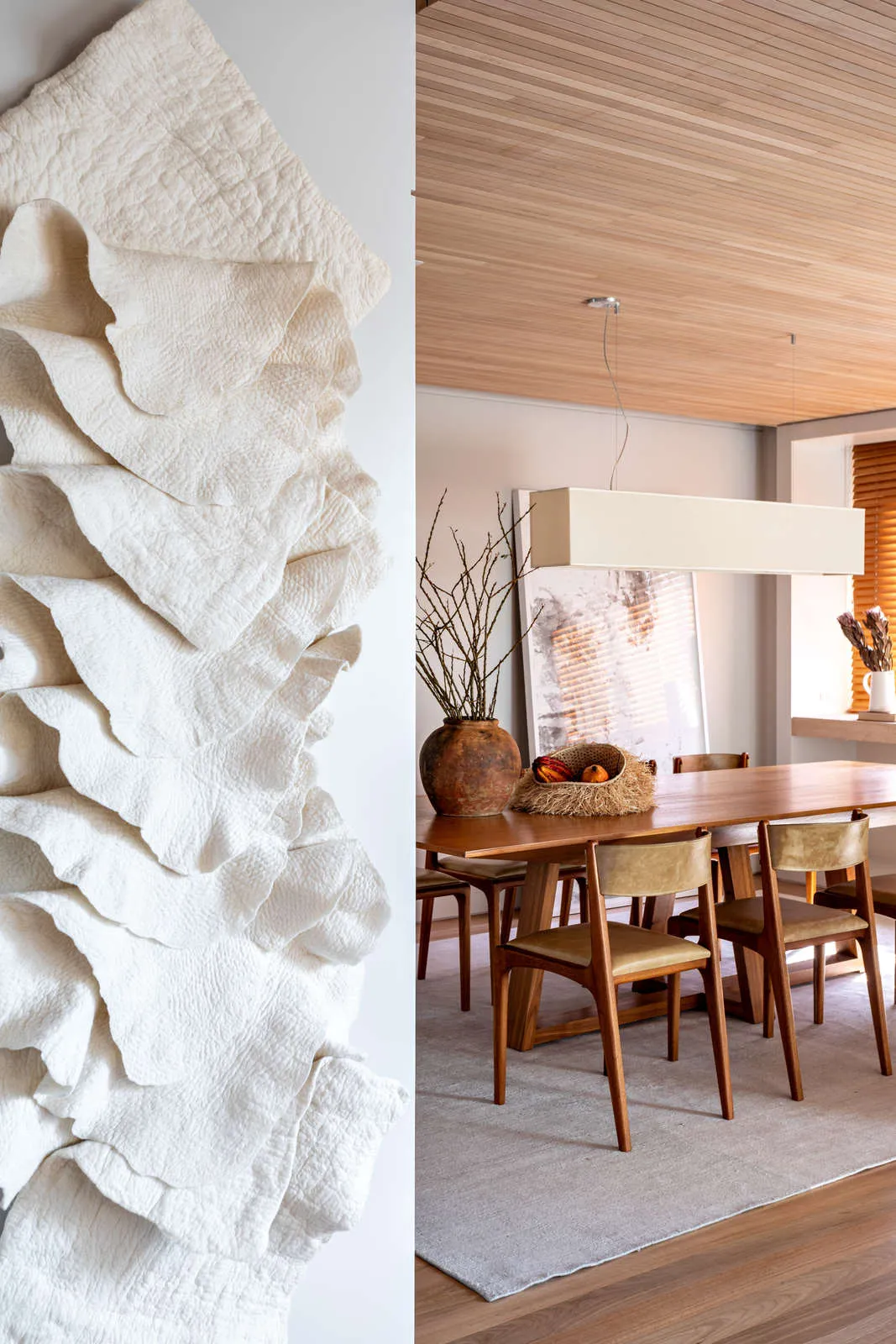
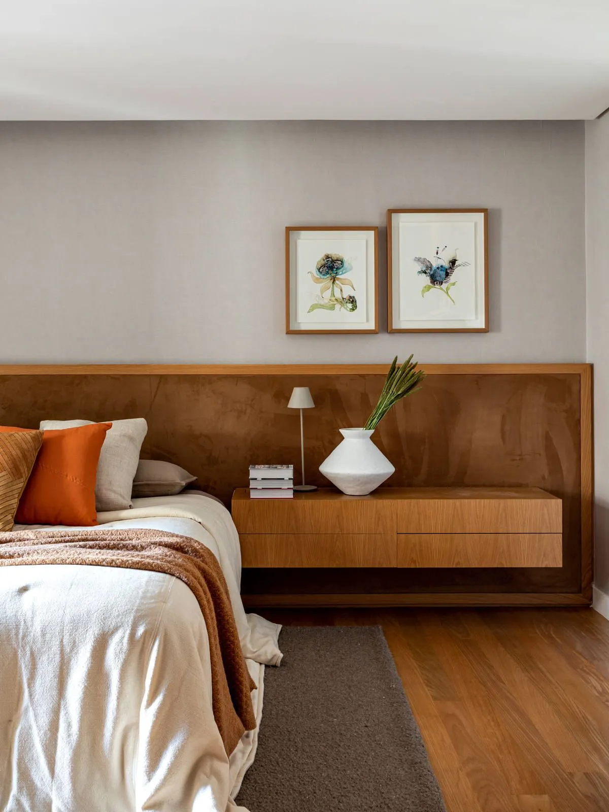
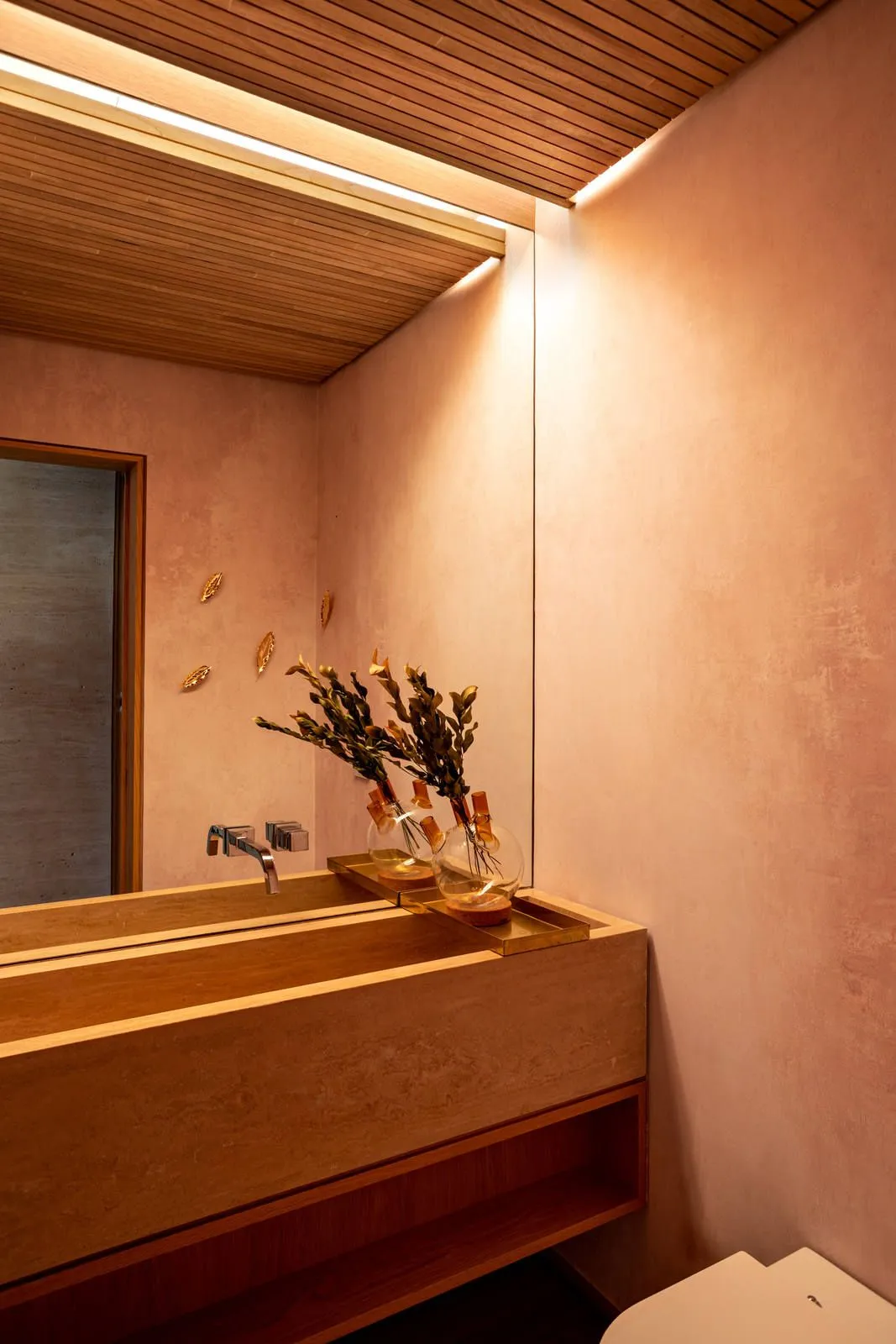
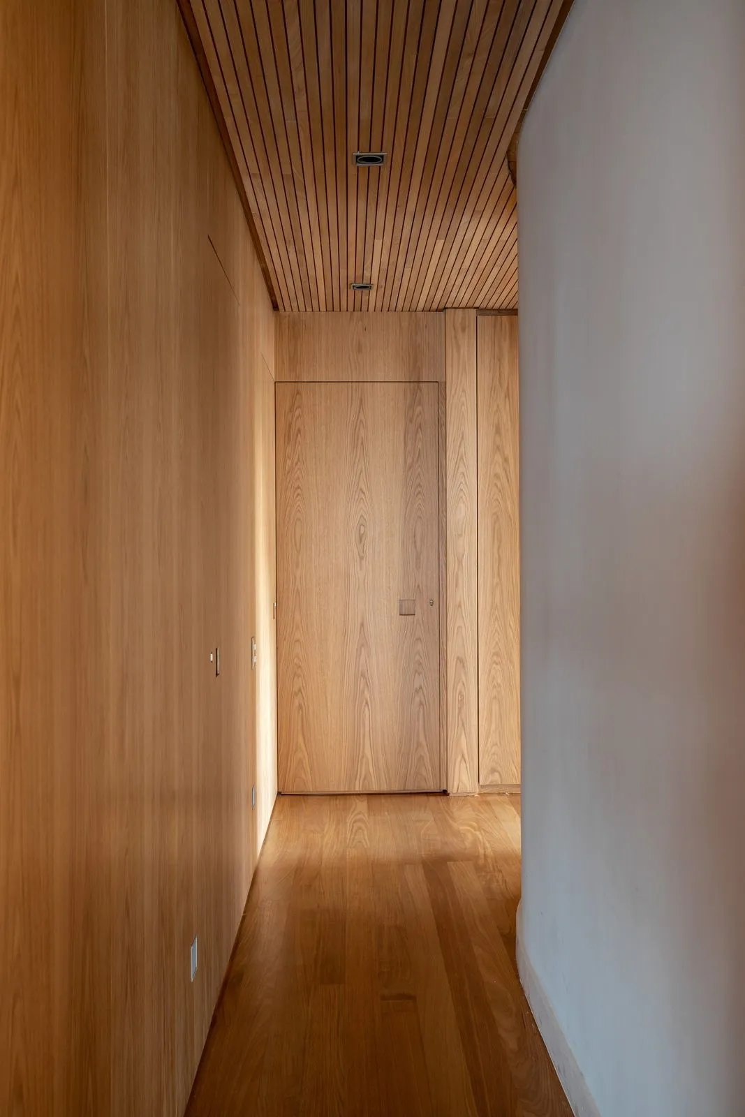
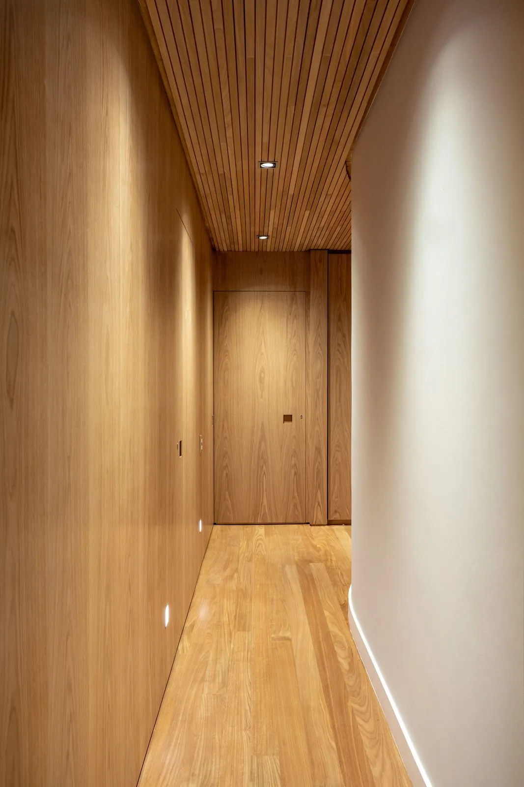
Fernanda Morais: “Yes. We wanted to create very cozy environments, so we opted for a clear joinery. There is a pale wooden floor with the joinery all drawn in white American oak. The ceiling is of slatted wood, more specifically Tauari wood with slats of three centimeters. Because of the significant use of wood, we take advantage of direct lighting. So since we had a very beautiful wooden lining, the idea was that it didn’t really have a lot of built-in lighting. Instead, we use sancas, decorative lamps, lampshades, floor lamp supports…

Source: Casadevalentina.com.br


